Typography
Our approach to the typographic system uses TLCircular-Bold as its brand typeface for titles and system fonts per platform for body and interface parts.
Depot's use of suitable scales, styles, and weights helps us create clear hierarchies and organise information. Our goal, as ever, is to guide users through the product experience in a way that is transparent, expected and delightful.
Typeface
Our product uses system fonts for better performance. By only embedding TLCircular-Bold as our brand typeface, we minimise the amount of requests made and reduce the time to interaction.

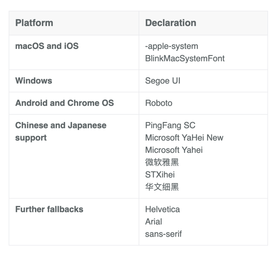
TLCircular is used for titles across any platform . SFPro is used for body and interface elements on IOS only. Roboto is used for body and interface elements on Android only.
Style
Typography aims to help users navigate information hierarchies. By the correct application of type styles and careful typographic treatment, we can maintain clarity of information and a clear structure throughout Depot products.
Weights
When it comes to font weight, balance must always be our primary concern. Depot uses TLCircular bold for titles, and system fonts Regular, SemiBold and Bold for body and interface elements. D-system uses semibold and Bold weight is for section headers and interface elements, but never for long text.

TLCircular bold for titles

SFProText regular for paragraphs, but semi bold and bold for interface elements

Roboto regular for paragraphs, but medium and bold for interface elements
Vertical rhythm
A vertical rhythm starts from a baseline. It’s the basis for everything. For type, the font sizes and the line height.
Baseline
A baseline in terms of vertical rhythm is essentially a vertical grid, everything must sit between the lines. For type it means the bottoms of letters sitting on the line.

Unit-less Line height
Always use multiples of 1.5 (or increments of 0.25) to adjust the lineheight to the baseline rythm.
D-system line height calculation method: 16px base font size * 1.5 = 24px line height (3 times 8px baseline grid)
In pixels, Depot uses increments of a 4px baseline grid, thus line height and font size must be multiples of number 4 to match the baseline grid of 8px.
D-system uses 16px as the font size for body copy. However, to align correctly to the baseline, an additional 8px needs to be made up. By having a 24px line height this means it will align to the baseline every other line. Falling nicely on even numbers, to give your base measurements.
When line height needs adjusting
Use incremental line height that follow increments of 0.25. The reason for this is because 48 × 1.25 is 60, which falls on our baseline measurement. If we were to deviate from this with 1.333333, it would equal 64, which is still a good number, but increases the difficulty, of aligning, back to our baseline.
Going up from here to 48 × 1.75, that equals 84, which also falls on our baseline.
Padding top or bottom for readjustments per instance.
If you were to use a number like 18px, it’s logical, this falls between 12px and 24px (the next multiple of our baseline). However when combined with the unitless line height of 1.5, it equals 27px. This is an awkward number to fall on, as it is odd.
You could adjust the line height, however, the solution is in the margin we use. Setting a bottom margin to be enough to add up to the next multiple of our baseline, which is 36px.
Micro margin and padding adjustments such as these are very useful in dark mode where line heights need extra sizing in small sizes.
Type hierarchy
Type hierarchy
Always follow a logical size hierarchy from bigger to smaller sizes to create hierachical harmony.
• All elements: 8px top + bottom
• First elements: no padding top
• Last elements: no padding bottom

Color
Type color should be carefully considered, with legibility and accessibility as paramount concerns. Keep type color neutral in running text. Use the link color for primary actions.

Visual examples:


Hero
Title1
Title2
Title3
Hero
Title1
Title2
Title3
D-system uses two breakpoint. The wide, for anything above 768px, like desktop monitors, and the narrow, for anything below 768px, like tablets and mobiles.
All apps should only use styles taken from the Narrow subset
Units
D-system covers a wide range of platforms and devices while aiming for a level of consistency across all. Since different platforms rely on different tech stacks, ensure you are using the correct unit for your platform. Here’s an overview:
Ems
An em was originally based on the width of a typeface’s capital M. Ems look to their parent element and scale the font size proportionally.
So if a font is 16 pixels:
1 em is 16 pixels
2 ems 32 pixels
1.5 ems Is 24 pixels
Rems (root ems)
Rems are relative to the HTML font size.A rem is calculated by taking your rem value and multiplying it by the HTML font size (which, unless you manually change it in the code, will respect the browser’s font size). This has the benefit of respecting a user’s browser preferences (if custom text size is set on the browser).
Percentages
Like ems, percentage refers to the parent element's font size.
VW
VW (viewport width) is a measurement of the width of the browser’s viewport that scales proportionally based on the width of the viewport.
CH
CH is great for sizing something like a paragraph or a heading to limit the number of characters someone has to read per line.
For example, If a paragraph has a maximum width of 60ch, it takes the selected font (the paragraph’s typeface), and sets the paragraph’s boundary (its box) to equal the width of 60 zeros. CH lets you set the WIDTH on a text element when you’re trying to limit the number of characters (again, based on the width of the font’s zero character.) When it comes to font size, in most cases, pixel values are a safe bet. We have alternatives like ems, rems, percentages, viewport widths, and CH.
Accessibility and inclusive typography
Accessibility and inclusive design are important to consider when designing for the web. Let’s look at some easy places to start making the web more accessible and inclusive when it comes to typography.
Font legibility
Thin fonts are extremely difficult to read — not only in Headings, but especially in paragraphs.
Make sure your font is no smaller than 16 pixels for body text.
Alignment of text
Uneven vertical alignment on chunks of text (when text is centered, for example) can create a difficult reading experience. A jagged alignment makes it tough for the reader to follow from line to line.
All caps
Languages that distinguish between capitalized and lowercase letters are often far more legible when written in sentence case (e.g., “Sentence case”) or title case (e.g., “Title Case”). Essentially, you write out your text only using capitalization where it’s needed or expected.
All caps can introduce a heavier cognitive load for the reader, especially in longer paragraphs. Screen readers announce all caps as individual letters, interrupting the flow and making it difficult to understand. Consider limiting the use of all caps on longer strings of text.
Underlined text
There’s an expectation on the web that underlined text indicates a hyperlink. If you’re trying to draw emphasis, consider using different UX tactics.
Color contrast
Contrast is the measurement of the difference between background and foreground. Low contrast would be something like somewhat lighter gray on somewhat darker gray. Or maroon on red. Or purple on pink.
High contrast doesn’t mean we stop considering other things like font weight (a super thin font that happens to have high-contrast against the background is still super illegible.) But higher contrast usually leads to increased legibility, which is a great thing on the web.
And you can check the color contrast of your designs and learn more about best practices with these excellent color contrast tools:
TPG’s Color Contrast Analyser
tanaguru contrast finder
WebAIM’s Contrast Checker
Colorable
Characters per line
Set limits on the maximum width of a text element to however many characters you want in a line using CH.(60 CH is equal to 60 zeroes in whatever font you’ve selected).
Line height
Text with adequate line height makes it much less overwhelming and easier to track across and down a page.
Your line height should be at least 1.5 times the font size for paragraphs and blocks of text.
Clearly-defined links
Your links should be meaningful and actionable. Screen readers can give visitors an overview of links on a page. When link text is read out of context, it should tell readers:
What the link is
Where the link is taking them
Don’t
Embed links in generic terms like “more,” “this page,” or “click here”
Link to raw URLs
Do
Embed links in clear, specific language that tells people where the link will take them and why they might want to go there
Indicate if a link will open high-bandwidth media like a PDF or video within the linked text
Use clear, descriptive, sequential headings
Unstructured web content is overwhelming and unusable for everyone, but especially for people with cognitive disabilities and those who use screen readers. Headings organize content and guide readers through your site.
Your headings should make it easy to skim a page and get a clear purpose and overview of content without having to read body copy.
Don’t:
Use heading levels to show visual differencesUse heading text just to be compliant — make sure it’s useful
Do:
Use one H1 per page that describes its purpose (or only use multiple H1s when a page truly has more than one purpose)
Nest headings in order (e.g., H3 under H2)
Use responsive text sizes
Browsers provide a built-in way for site visitors to adjust the base text size for websites, zoom in to content, and enlarge sites to a more comfortable viewing size. However, text styled in pixel (px) units ignore the browser’s text size setting, preventing site visitors from enlarging text for more comfortable reading and creating a poor user experience. Adding a “viewport” meta tag with the values “user-scalable=no” or “maximum-scale=1.0” can also prevent users from zooming in to view content.
To create an accessible reading experience, use root ems (rem) units for text size. Rems are relative to the base text size defined by the site visitor and respect the site visitor’s browser preferences.
Don’t:
Style text size with pixel (px) units
Add the “user-scalable” or “maximum-scale” values to the “viewport” meta tag
Do:
Style text size with rem units
People with low vision sometimes resize text larger than the 16px default.
When we set font sizes in absolute units, like px, the page doesn’t always respect the user’s preference and instead shows the text at the font-size authored.
Let’s look at some best practices to make sure users can resize text on your site.
Never use absolute units (px, pt) for lengthsUse relative units like em, %, and viewport width/height for all spacing and length properties.
Use rem for all font-size propertiesRems are a complex concept, but you can assume that 1 rem is equal to 16px.
Set body font size to 100% or 1rem, in order to respect the browser preference
Use rem and em units appropriately for spacing units depending on if an element needs to scale based on the body or the inherited type scale.
Don’t disable zoom
.
People with partial vision and low vision enlarge text to make it more readable.
Using user-scalable=”no” in the <meta name=”viewport” element blocks people from resizing text, and ultimately from using your site.
Make sure viewport zoom isn’t disabled
A meta viewport element tells the browser how to scale and control the page's dimensions, but zoom can be disabled as a result of its use.
To avoid disabling zoom:
Don’t set custom attribute to user-scalable=”no”
Remove the user-scalable="no"parameter from the content attribute of the <meta name="viewport"> element if it’s been added element
WCAG reference:1.4.4 Resize text
Allow zoom without forcing horizontal scrolling
People with low vision use zoom to scale content, sometimes up to 400%. As they zoom, content should reflow vertically (as a column) and remain fully legible and logical without a need for horizontal scrolling.
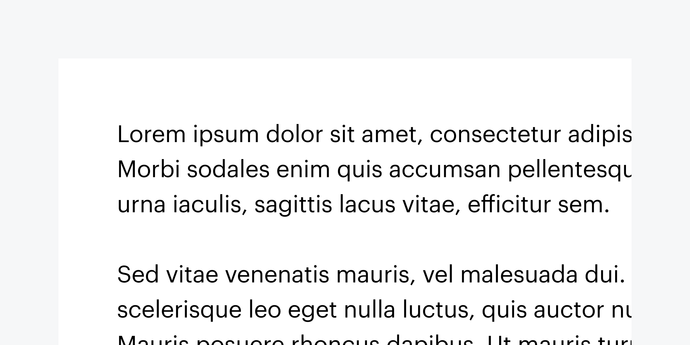
The div that contains this paragraph has a width of 800px. This causes text to overflow horizontally at a 400% zoom.
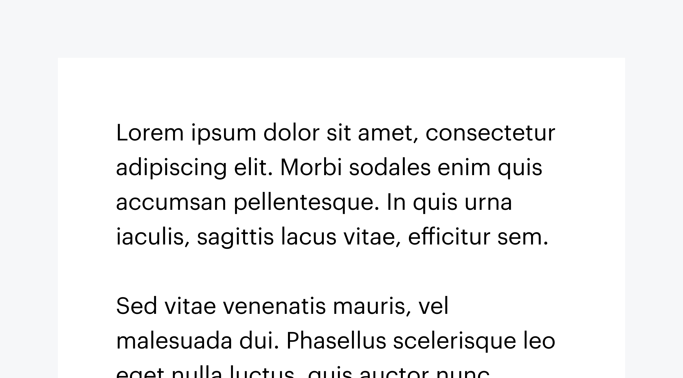
The div that contains this paragraph has a width of 80%, so content reflows on zoom and does not overflow horizontally
Here are some considerations to keep in mind to make sure reflow doesn’t force horizontal scroll.
Use relative units (like percentages and viewport width) to set width on text and images
Check all breakpoints to make sure content doesn’t reflow horizontally
"Supporting the reflow of content is also known as 'Responsive Web Design'. It is enabled by CSS media queries which reformat the web content for different viewport widths (at particular break points) in order to provide optimized layouts for mobile devices such as tablets or smartphones. Importantly, these breakpoints are not only triggered by narrower viewports, but also when users employ the browser zoom function to zoom into the page."
Within D-system, there are two type size sets available for use, "Wide" and "Narrow".
The focused are suggested for product design and they are smaller comparing dramatic that are bigger and suggested for website pages.

The overarching rule has been to use the narrow for product design and the wide for editorial pages.
For the most part, this is still a good guideline to follow. However, there are situations where we can create contrasting moments that better support the user’s intention or task.

Type sizes and styles
The wide type sizes are primarily used for web pages and the larger sizes allow for a more contrasty, graphic use of type in editorial and marketing design.
These type styles are excellent for long form reading and scanning, but would be distracting for use in product.
The narrow type size is primarily used within product spaces, where users benefit from a more condensed treatment of content to maintain focus on tasks.


Let’s look at the respective design rationales for each experience, and then see where it makes sense to provide a blend.
Narrow type use cases
Hero
Title1
Title2
Title3
The key drivers for the use of narrow type sizes are:
Users are focused on getting a specific job done.
Interactions are more active, through inputs, forms, and controls.
Users are embedded within the experience, often on one page, for awhile.
Key performance indicators consider success in terms of time needed to complete a task and also the abandonment rate.
Given these considerations, space efficiency is key. Keeping content condensed is helpful to support focus on complex tasks.

Wide type use cases
Hero
Title1
Title2
Title3
The key drivers for the use of wide type sizes are:
Users are trying to learn and explore, and are primarily scanning and reading.
Interactions are more passive through impactful imagery, layout, and long form reading.
Users typically traverse a series of pages during one session.
Key performance indicators consider success in terms of click-through rates and final purchases.
Given these considerations, larger type sizes and a more editorial approach allows users to scan, read, and navigate multiple pages with comfort and ease.

Blending type sets
The spaces we are designing for are no longer neatly divided between product and marketing most of the times. Both product and web pages can be blended. If the alternative type set better supports the function.
Users working in product pages benefit from a narrow style for easy reading or a pause. In these cases, however the experience would span a full page or banner where there are no containers.
If your users are on the website and reading, but then switch to a focused task within the web experience, using narrow styles within that component would facilitate focus.
Using wide moments within product designs
The product experience is all about keeping the user focused and able to complete complex tasks, therefore the areas where wide type experience can be used are less common. However, when the user is first entering the product, or moving to another area of the product you may find opportunities.
For wide experiences, you are looking for areas where the page opens up and the content is not restricted to a container, card, or data table. Home pages and page headers or banners are two possibilites.
Tips and techniques
Use a blend of the two sets to establish distinctions and create hierarchies. You can use the two type sets to provide contrast and hierarchy within two areas. For example, an element using narrow type becomes less prominent next to a list of results using wide type styles.
Match and support user tasks. Within each type set, there are appropriately sized type sizes for each user task. Follow the use case definitions for wide and narrow experiences to determine when it’s appropriate to use each type set.
When users need to focus on a task and are interacting through inputs, forms, and controls, use the narrow type set.
When users are learning and exploring, and interacting through impactful imagery, layout, and long form reading, pull from the wide type set.
Keep type styles consistent within a discrete task, component, or region. People unconsciously use type size as a signal of hierarchy, and each type set has been designed with expectations about hierarchy in mind. Mixing type styles within a component could jumble the hierarchy and create confusion.


Wide (Dramatic - Desktop / marketing / responsive)
Narrow (Focused - Product / non-responsive)
This is the Hero
This is Title1
This is Title2
This is Title3
This is the Hero
This is Title1
This is Title2
This is Title3
Use responsive text sizes
Browsers provide a built-in way for site visitors to adjust the base text size for websites, zoom in to content, and enlarge sites to a more comfortable viewing size. However, text styled in pixel (px) units ignore the browser’s text size setting, preventing site visitors from enlarging text for more comfortable reading and creating a poor user experience.
Adding a “viewport” meta tag with the values “user-scalable=no” or “maximum-scale=1.0” can also prevent users from zooming in to view content.
To create an accessible reading experience, use root ems (rem) units for text size. Rems are relative to the base text size defined by the site visitor and respect the site visitor’s browser preferences.
Don’t:
Style text size with pixel (px) units
Add the “user-scalable” or “maximum-scale” values to the “viewport” meta tag
Do:
Style text size with rem units
