Tooltip
Tooltips are floating labels to describe or add additional information when users hover over, focus on, or click an interactive element (touch screens).
A tooltip is a brief, informative message (three or less words) that appears when a user interacts with an element in a graphical user interface (GUI). Tooltips are usually initiated in one of two ways: through a mouse-hover gesture or through a keyboard-hover gesture*.
Tooltips can be attached to any active element (icons, text links, buttons, etc.) on a page. They provide descriptions or explanations for their paired element. Thus, tooltips are highly contextual and specific and don’t explain the bigger picture or entire task flow

One important aspect of tooltips is that they are user-triggered. Therefore, tips that pop up on pages to inform users about new features or how to use a specific functionality are not tooltips. Because tooltips are initiated by a hover gesture, they can be used only on devices with a mouse or keyboard. They are not normally available on touchscreens.
Tooltips aren’t new, but they’re still misused.


Do use helper text for pertinent information.


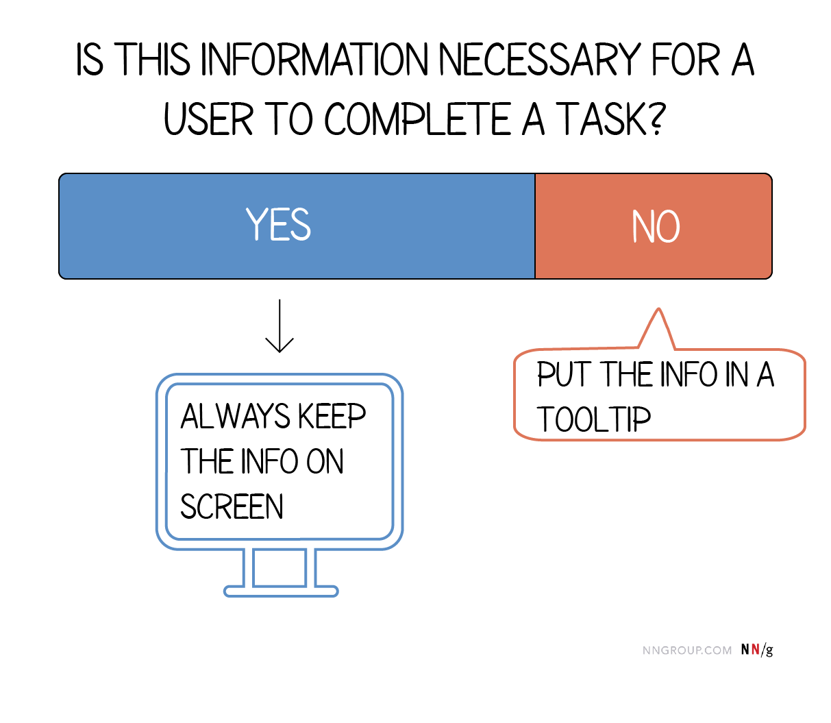
Do not use tooltips for information for a user to complete their task.

Use succinct, directive text.

Do not use interactive elements within a tooltip. Use a *toggletip instead.
Need to know
Tooltips are used to provide additional information when space is tight.
Tooltips must be concise with one or more lines of text.
Tooltips must be accessible via hover and focus only.
Trigger tooltips from Interactive elements (Buttons, Links, Icon buttons) or Non-interactive elements (Icons, Abbreviations, Truncated text)—be mindful of keyboard accessibility
Use sparingly. Tooltips innately hide information. Consider exposing it immediately without a tooltip or removing it completely.
Never include any kind of error messages in a tooltip
Tooltips have slightly different guidelines to Popovers and Modals. For more information, see Popover and Modal guidelines.
If the information is crucial for a user to proceed, consider using a modal or notification instead.
Position tooltips so they don’t block related content.
Tooltips are often a fail-safe for users when they can’t understand a feature. Many of today’s use cases for tooltips could be omitted if people followed other design guidelines (for example, labeling icons). Important information should always be on the page; therefore, tooltips shouldn’t be essential for the tasks users need to accomplish on your site.
Content
Should contain relevant, specific content.
Keep tooltips short and concise, no longer than a sentence or two.
Should not contain required information essential for a user to complete their task since a tooltip is not persistent.
Use sentence-style capitalization and write the text as full sentences with punctuation, unless space is limited.
Icon button tooltips that describe a button’s function should only contain one or two words.
Universal behaviors
States:
The tooltip component has two states: active and inactive. By default, the tooltip is hidden and inactive. Tooltips are displayed on hover and focus. Definition tooltips though can be displayed either on hover and focus or on click and enter.
Interactions:
Mouse:
Tooltips are triggered when the mouse hovers over or focuses on the UI trigger. The tooltip persists as long as the mouse remains over the active container or the UI trigger. The tooltip is dismissed by hovering away or moving focus to another element. Definition tooltip can additionally be activated on click or enter and dismissed by clicking outside of active container or UI element.
Keyboard:
Users can trigger a tooltip by focusing on element. Addtionally, a definition tooltip can be triggered by using the enter key. A tooltip dismissible by use of the escape key.
Screen readers/VoiceOver:
Users can trigger a button to open a popover by pressing enter or space while the button has focus.
* Toggletips vs Tooltips
The two components differ in the way they are invoked and dismissed and if the user must interact with the contents.
A tooltip is exposed on hover or focus when you need to expose brief, supplemental information that is not interactive.
A toggletip is used on click or enter when you need to expose interactive elements, such as button, that a user needs to interact with.
Tooltips vs. Popover, Coachmarks and Modals
Tooltips are floating labels to describe or add additional information when users hover over, focus on, or click an interactive element. Usually 3 words or less.
A popover displays rich content in a non-modal dialog to describe or add additional information when users hover over, focus on, or click an interactive element. User can interact with popover content, including selecting text or clicking links.
Coachmarks: Coachmarks are used for guided tours to onboard people to new interfaces. We rarely use coachmarks. When we do, they follow our Popover style.
Modals show additional content in a layer above the page with an overlay covering the page behind. Use sparingly.
* Tooltips vs. Popup Tips
Although tooltips are mainly limited to desktop computers and laptops, they do have a sister element that is common on touchscreen devices: popup tips. Both tooltips and popup tips have the same goal: to provide helpful, additional content. The following table shows the key similarities and differences between popup tips and tooltips.
The Tooltip should be paired with an interactive UI element like a button, icon or text. Tooltips should be used sparingly and contain supplementary information.

Standard tooltip
A standard tooltip is used to provide more information to help a user complete a task and is always paired with an interactive UI element such as a button or link.
Do not include interactive elements within a tooltip. If interactive elements are needed use a toggle tip instead.
Default tooltip content, such as when using an information icon, should be precise and related.

Icon Button Tooltip
An icon button tooltip is used to describe the function or action of an icon button that has no label to provide clarity on what the button will do.
Should only contain one or two words.
Should use icon button tooltip instead of the title attribute. Do not use both.

Definition Tooltip
The definition tooltip provides inline additional help or defines a term. It may be used on the label of a UI element, on a word embedded in a paragraph, or in compact spaces such as data tables where icons clutter the UI.
You can use definition tooltips on headers, body copy, or labels.
Should contain brief, read-only text
Use on proper nouns, technical terms, or acronyms with two letters or more
Do not use a definition tooltip on words with fewer than two letters
Overall
When to use:
Use when the description content would be too much information to include inline or create too much clutter. For example, when expert users have seen it many times.
Use for icon-only buttons, text links (e.g. Opens in a new tab) or for a button with an associated keyboard shortcut.
Describe icon buttons
When more information is useful in helping a user make decisions
When an element needs more context or explanation
Use when defining a term or inline item
Ensure tooltips have moderate contrast against the background.
Provide tooltips for unlabeled icons.
When not to use
Don’t use tooltips to restate visible UI text.
If you need lots of icons to trigger lots of tooltips, consider an onboarding pattern, such as Coach Marks (TBD).
If you need to show a message on page load, consider Popovers or an onboarding pattern, such as Coach Marks (TBD).
To communicate critical information, including errors in forms or other interaction feedback. Consider using Modals or Notifications
When you need to include links or buttons. Consider using a Popover.
Since a tooltip disappears when a user hovers away, do not include information that is pertinent for the user to complete their task. Use helper text that is always visible and accessible for vital information such as required fields.
Do not include interactive elements within a tooltip. Interactive elements in tooltips are inaccessible for some users and are hard to use for all users since tooltips do not receive focus. If images, buttons, or links need to be included in supplemental information, use the toggletip component and the disclosure pattern that allows for better tabbing and focus structure, improving the experience for all users.
A Standard Tooltip provides nonessential, supplemental information to help a user make a decision
Formating

UI trigger button: Element that triggers a tooltip on hover or focus
Caret tip: Closely associates container to specific trigger element
Container: Contains helper text
Alignment

The container of the tooltip may be aligned to start, center or end to keep the container from bleeding off the page or covering important information. The UI trigger button and caret tip should be vertically center with each other to clearly associate the tooltip and the trigger. This is especially helpful when multiple elements are close to each other.
Placement

Tooltip directions by default are set to auto. Upon opening, tooltips can detect the edges of the browser to properly be placed in view so the container does not get cutoff. Tooltips can instead use specific directions and may be positioned top, right, bottom, or left to the trigger item. Tooltips should be placed at least 16px / 1rem off of the bottom of the page and not bleed off page or behind other content.
Color


Interactive states
Typography
Structure
All tooltip types have a varying height based on the amount of content they contain.

An icon button tooltip is used to describe the function or action of an icon button that has no label to provide clarity on what the button will do.
Formating

Icon button: Button that triggers a tooltip on hover or focus
Caret tip: Closely associates container to specific trigger element
Container: Contains helper text
Alignment

The container of the tooltip may be aligned to start, center or end to keep the container from bleeding off the page or covering important information. The UI trigger button and caret tip should be vertically center with each other to clearly associate the tooltip and the trigger. This is especially helpful when multiple elements are close to each other.
Placement

Tooltip directions by default are set to auto. Upon opening, tooltips can detect the edges of the browser to properly be placed in view so the container does not get cutoff. Tooltips can instead use specific directions and may be positioned top, right, bottom, or left to the trigger item. Tooltips should be placed at least 16px / 1rem off of the bottom of the page and not bleed off page or behind other content.
Color


Interactive states
Icon button tooltip states rely on what kind of button is being used. Refer to button styles for specific hover and focus states.
Typography
Structure

A definition tooltip provides additional help or defines an item or term. It may be used on the label of a UI element, or on a word embedded in a paragraph.
Formating

UI trigger: Definition indicator: Underline below text that cues
Caret tip: Closely associates container to term to be defined
Container: Contains helper text
Alignment

The container of the tooltip may be aligned to start, center or end to keep the container from bleeding off the page or covering important information. The UI trigger button and caret tip should be vertically center with each other to clearly associate the tooltip and the trigger. This is especially helpful when multiple elements are close to each other.
Placement

Tooltip directions by default are set to auto. Upon opening, tooltips can detect the edges of the browser to properly be placed in view so the container does not get cutoff. Tooltips can instead use specific directions and may be positioned top and bottom to the trigger item. Tooltips should be placed at least 16px / 1rem off of the bottom of the page and not bleed off page or behind other content.
Color


Interactive states
Typography
Structure

Standard tooltips
Alignment

Placement
Icon button tooltip
Alignment

Placement
Definition tooltips
Alignment
Placement
Accessibility considerations
Tooltips contain limited content so we can use an ‘announcer’ to announce tooltip content to people using screen readers e.g. using an ARIA live region.
After the tooltip opens, initial focus should be set on the first focusable element in the tooltip. See WAI-ARIA Authoring Practices Modal Dialog Example, Accessibility Features section for best practices on setting focus. Note: This does not apply to the tooltip icon or tooltip definition components.
After the tooltip closes, focus should retain the user’s point of regard and return to the element that invoked it. Note: This does not apply to the tooltip icon or tooltip definition components where focus never leaves the element that invokes it.
The tooltip component’s focus must not move outside the modal until it is closed. Note: This does not apply to the tooltip icon or tooltip definition components, as noted above, focus never leaves the element that invokes it.
The tooltip component’s focus must not move outside the modal until it is closed. Note: This does not apply to the tooltip icon or tooltip definition components, as noted above, focus never leaves the element that invokes it.
ARIA: tooltip role:
https://developer.mozilla.org/en-US/docs/Web/Accessibility/ARIA/Roles/tooltip_role
Tooltips in the time of WCAG 2.1:
https://sarahmhigley.com/writing/tooltips-in-wcag-21/
Inclusive Components:
https://inclusive-components.design/tooltips-toggletips/
Building a fully-accessible help tooltip...is harder than I thought:


