Popover
Popovers* are used as a base layer in some of our components like tooltips, toggletips, overflow menus and dropdown menus. Frequently, a popover is a part of a larger composite component, such as a select, a combobox, or a menu. Its content will vary depending on its particular usage (Disclosure):

A popover* is a layer that appears above all other content on the page. Only one popover can appear at a time and can contain varying text and interactive elements.
** Check elevation component under the backdrop tab for better understanding of the color selection.
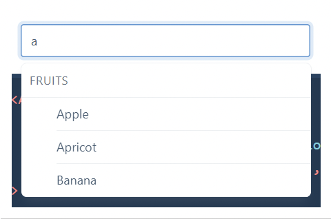
1. Autocomplete (Popup Part): similar to an input and datalist, the user types into a field and options to complete their input appear.
2. Combobox (Popup Part): the user can choose to enter text in a field or make a selection from a pre-populated list

3. Date-Time Picker (Popup Part): enables the user to pick date(s) and/or time(s)
4. Menu: Upon invoking some element, often a button, a popup containing menu items appears. The menu items are actions the user can take—e.g. edit, delete, favorite—vs links for navigation. Can have multiple layers of menu as nested popups.
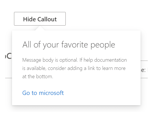
5. Misc: teaching UI and other misc popups, often supporting arbitrary content.

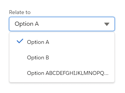
6. Select (Popup Part): Enables the user to select a single text option. May literally use the native select. May include semantic groupings within options.
https://open-ui.org/components/popup.research#popup
Related
Form components
Form components that have menus, like dropdowns, use popovers as a base layer.
Disclosures
Disclosures use popovers as a base layer. Disclosures are comprised of a popover container, text, and interactive elements. For further guidance, see disclosure pattern.
Overflow menus
Overflow menus use popovers as a base layer. When the overflow menu icon button is triggered, the menu opens and uses a tab tip popover as its base.
Toggletips
Toggletips use the popovers as a base layer. Toggletips allow interactive elements within the popover container while still being accessible. For further guidance, see toggletip component
Tooltips
Tooltips use popovers as a base layer. Tooltips are comprised of a trigger button, popover container and text. For further guidance, see tooltip component.
By default, a popover's structure is made up of a container with no additional tip. Depending on the use case, caret tips or tab tips can be added to the container to help show the relationship between the popover and where it was triggered from.
Use when placing interactive elements, like links, buttons, or rich media to make the component more accessible. Disclosures that contain interactive elements use popovers as a base container layer to achieve this accessibility standard. For further guidance on how to display content within a popover, see the disclosure pattern.
Use when you need to display additional details for specific elements on a page. If your popover exceeds four columns in width, use a modal instead.
Variants


No tip
Popovers without a tip can be used for a wide variety of different use cases. No tip popovers are typically used when the trigger button has a visually defined down state.


Caret tip
Popovers with a caret tip should be used to help show the relationship between the popover and where it was triggered from. A caret tip is typically used when the trigger button does not have a visually defined down state and for icon buttons.


Tab tip
Popovers can have a tab tip when the popover is connected to a toolbar or menu where the trigger button sits within.
Anatomy

UI trigger button: An interactive element that triggers the popover to open on click, hover, or focus.
Tip: An indicator that is added to a popover container to help show the relationship between the popover and where it was triggered from.
Content area: An area to place text and interactive elements.
Container: An area to place text and interactive elements.
Sizing

The width and height of a popover container can vary depending on the amount of content placed within it but it should not exceed a popover width size of four columns (desktop-tablet) while on mobile can occupy the full canvas width.
Trigger button
A popover is controlled by a trigger button. By default, we use an icon button to trigger a popover to open. However, as long as the trigger button is interactive it can visually change its shape and size depending on the usecase.
The trigger button can open the popover on click, hover, or focus depending on what it is being used for. For more information about trigger buttons, see the disclosure pattern.
Interactions

Mouse:
Users trigger a popover to open and close by clicking or hovering on the trigger button depending on the use case.
Click:
Open the popover by clicking on the trigger button. Close the popover by clicking on the trigger button again, or anywhere outside of the open popover container. (depends on instance)
Hover:
Open the popover by hovering over the trigger button. Close the popover by hovering off of the popover or clicking anywhere outside of the open popover container.
Keyboard
Focus:
When the popover control has focus Enter or Space activates the popover control and toggles the visibility of the popover content.
Screen readers:
VoiceOver: Users can trigger a button to open a popover by pressing Enter or Space while the button has focus.
JAWS: Users can trigger a button to open a popover by pressing Enter or Space while the button has focus.
NVDA: Users can trigger a button to open a popover by pressing Enter or Space while the button has focus.
VoiceOver:
Users can trigger a button to open a popover by pressing Enter or Space while the button has focus.
Content
Main elements
Heading, body, and footer content can vary based on your usecase. To see examples of content used in popovers, see the disclosure pattern.
Overflow content
Scrolling is usually not needed when using a popover. If scrolling is needed, in a dropdown like situation for instance, then the body section should not scroll vertically with the header and footer remaining fixed in place if those elements are present. Do not scroll horizontally or let content bleed off the page.
Modifiers
Colors


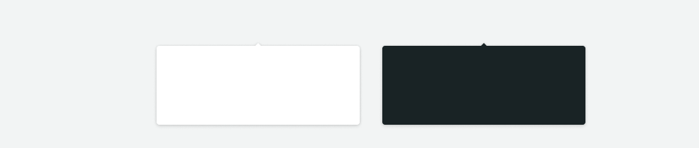
Popovers are most commonly used in these three different container colors—$backdrop_base, $backdrop_dark, and $text_base.
Corners


A popover container has rounded corners by default and the corner radius is set to 4px. Use straight corners when the popover structure contains a tab tip and is connected to a toolbar or header to keep clean lines between the popover and the layer underneath.
Popovers without a tip can be used for a wide variety of different use cases. No tip popovers are typically used when the trigger button has a visually defined down state.
Placement
Popover directions by default are set to auto. Upon opening, popovers can detect the edges of the browser to properly be placed in view so the container does not get cutoff. Alternatively, popovers can also specify distinct directions. Direction options vary depending on the popover variant.
When a popover does not have a tip, the trigger button should be flush to the side of the popover. The popover can open from the left, right, bottom, or top of the trigger button.


Alignment
The trigger button should be placed 4px away from the popover container and should always be the same distance away from the popover container regardless of what size button is being used. It should also align right to the edges of its popover or occupy the full width of its popover sibling.


Align the popover edge with the trigger button.

Don't arbitrarily place the popover near the trigger button.
Color

Structure
The width and height of a popover container can vary depending on the amount of content within it. We recommend to not exceed a popover width size of four columns.

Structure and spacing measurements for a popover container. Remember to use a Modal component instead if the content is too long.
Structure and spacing measurements between a popover container and its trigger button.
Popovers with a caret tip should be used to help show the relationship between the popover and where it was triggered from. A caret tip is typically used when the trigger button does not have a visually defined down state and for icon buttons.
Placement
The popover can open from the left, right, bottom, or top of the trigger button. When using a caret tip, the trigger button and caret tip should be vertically center with eachother.

Alignment
The container of the popover may be aligned to start, center, or end to keep the container from bleeding off the page or covering important information.

Color
Structure
The width and height of a popover container can vary depending on the amount of content within it. We recommend to not exceed a popover width size of four columns.

Structure and spacing measurements between a popover container and its trigger button. Similarly with no tip popovers, a trigger button paired with a caret tip popover should be placed 4px away from the popover container. Remember to use a Modal component instead if the content is too long.


Do align the caret tip center with the trigger button.


Don't misalign the caret tip with the trigger button.
Popovers can have a tab tip when the popover is connected to a toolbar or menu where the trigger button sits within.
Placement
Tab tip popovers nest within another layer on a page. The tab tip can appear on the left and right of the container and the edges should be flush with the layer edges it sits within.

Alignment
Popovers with a tab tip have 0px space between the trigger button and the container because they are connected to each other.

Color

Structure
The width and height of a popover container can vary depending on the amount of content within it. We recommend to not exceed a popover width size of four columns.

Structure and spacing measurements for a popover container. Remember to use a Modal component instead if the content is too long.
Structure and spacing measurements between a popover container and its tab tip. Popovers with a tab tip have 0px space between the trigger button and the container because they are connected to each other.
Updating

Updating
Updating
Accessibility considerations
Popup,Component research, (OpenUI)
Disclosure, W3C WAI-ARIA practices, (W3C Working Group Note)
When keyboard users tabs into modals (like a popup or dialog), focus should remain in that window. This helps prevent users from accidentally moving focus outside the modal without closing it. Users should be able to use the ESC key to close the modal.
Tab through your page to make sure modals are keyboard navigable
You want to make sure that as you tab through your page, focus doesn’t jump outside the modal window to the main page where it will be hidden.
Tap enter on the button that opens the modal
Tab into the elements within the modal
When the modal is open, try tapping the ESC key to make sure it closes the modal.


