Animation foundation
Introduction
Manifesto
Through animation, we make our products more pleasurable and usable for our customers.
Animation should be built into every bone of our collective locomotive body. We want the ability to implement animation in our products at all levels; from the shortest of transitions to full rich interactive experiences, in a way that is straight-forward for designers and developers to implement, inherently feels Trainline, and allows us to push the boat out, try something new and innovate!
Animation is...
A First Class Citizen - it is every bit as important as colour, typography, layout or tone of voice in communicating with our customers
Given the time it needs - we design with animation from the start as part of the design and development process, instead of an afterthought
Easy to implement - we have the knowledge and tools available to reduce friction, ease communication and reduce time spent
Supported by a community - we help each other to learn it’s nuances, technologies and skills to animate with ease, dexterity and efficiency.
Our brand in motion
Our brand aligns with our product values, and should behave accordingly. It is smart, friction-free, seamless and intuitive. Opposite to productive animation, a core type of basic and subtle animation applied across the product, our branded animation is more expressive, more visible and recognisably “us”. As such, it is refered to as expressive animation/transitions within Depot.
Time and place
Branded animation should be expressed at positive and useful moments in the user experience. When a key action has been completed, i.e. when a booking is confirmed, a refund has been received or even when the app is opened, we can shout about our brand. In contrast, when your train is cancelled, a train strike is on or an app error has occured, the time isn’t right. Productive animation can still be used, but we should avoid tying our brand to negative experiences, especially if these are our of our control. Equally, don’t animate for the sake of animating, or make the user wait for your animation to finish playing.
Feel
Animation properties such as easing, scaling and transformation heavily contribute to the feel of a product. Movements on our products should be swift and smooth, just like that perfect train journey. Efficiency is the key in making sure motion is a helpful addition. Looping animations should only be used in small measures to portray continuity and give crucial reminders, if it serves a clear contextual purpose within the user experience.
Principles & Approach
Principles
Add customer value - make our amazing E2E customer experience more pleasurable or usable
Make it accessible - animation should never be at the detriment of our less-abled customers
Make it performant - make it fluent and feel natural whilst minimising effect on page load times
Make it sustainable - use lightweight technologies and align with our green values
Favour simplicity - avoid overly complex animations and keep its maintenance in mind
It feels Trainline - customers recognise the feel of our brand
Approach and workflow
- Consider the value - explore earlier examples within our products and beyond. Does animation add anything to your feature?
- Check our guidelines - for examples, patterns, usage and inspiration on animation
- Design and iterate - storyboarding and prototyping in Figma, After Effects or Codepen and involve engineering early
- Review - ensure it meets our brand and product requirements, and that it’s technically feasible
- Implement - consider technology, accessibility, best practices and performance
D-system uses two styles of transitioning:
productive, and expressive.
Transitions are the animated changes between two views or pages.
D-system components can have transitions built in for micro-interactions. However, the animation design of the overarching UI — that is, how the components interact with each other and enter and exit the page itself — is up to each product team to implement. Use this guidance to customise, combine, coordinate, and organise this aspect of animation in the UI.
Easing and duration summary:
Productivity and expression are both essential to an interface.
Reserve expressive transitioning for occasional, important moments, to better capture the user’s attention and offer a rhythmic break to the productive experience.
Productive transition
Productive transition creates a sense of efficiency and responsiveness, while remain subtle and out of the way.
When to use:
Use productive transition moments when the user needs to focus on completing tasks (microinteractions): button states, dropdowns, revealing additional information, or rendering data tables and visualizations.
Expressive transition
Expressive transition delivers enthusiastic, vibrant, and highly visible movement.

When to use:
Use expressive transition for significant moments such as opening a new page, clicking the primary action button, or when the movement itself conveys a meaning. System alerts and the appearance of notification boxes are great cases for expressive motion.
Strictly linear movement appears unnatural to the human eye. Elements on the screen should speed up quickly and slow down smoothly, obeying the physics of a light-weight material.
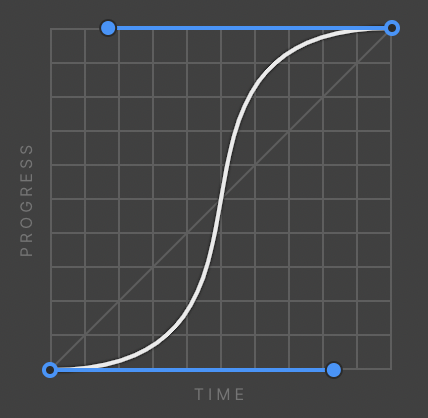
“Easing curves” describe the precise amount of accelerations in a transition. We commonly use one of these types of easing.
Analysis, usage and paradigms:
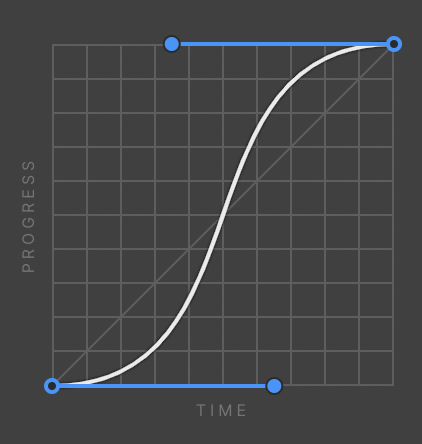
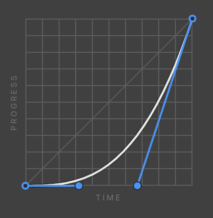
standard-easing
Use standard-easing when an element is visible from the beginning to the end of a motion. Expanding tiles and the sorting of table rows are good examples.
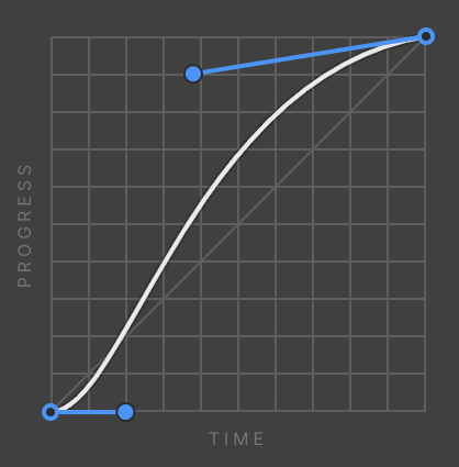
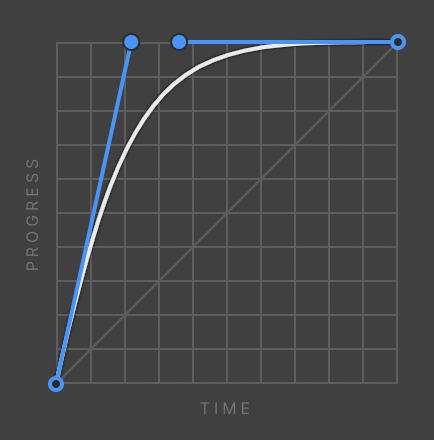
entrance-easing
With this style, an element quickly appears and slows down to a stop. Use entrance-easing when adding elements to the view, such as a modal or toaster appearing. Elements moving in response to the user’s input, such as a dropdown opening or toggle switching should also use this style.
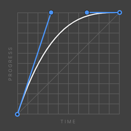
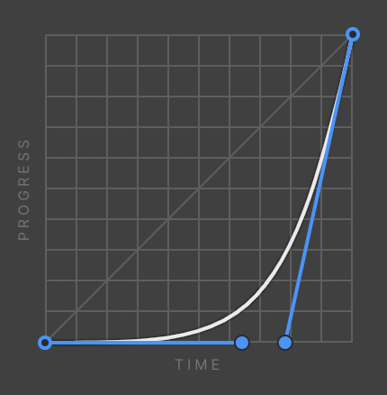
exit-easing
Use exit-easing when removing elements from view, such as closing a modal or toaster. The element speeds up as it exits from view, implying that its departure from the screen is permanent. An exception to exits: if an element leaves the view but stays nearby, ready to reappear upon user action, use standard easing instead. A good example of this is a side panel. The panel leaves the view, but slows down as it exits, implying that it would come to rest just outside the view, and ready to be recalled.
Don't:
Avoid easing curves that are unnatural, distracting, or purely decorative. Depot transitions is essential and efficient, guiding users to value as quickly as possible.
Linear
Elastic
Bouncing
Duration is calculated based on the style and size of a transition. Productive transition is significantly faster than expressive transition.
transition’s duration should be dynamic based on the size of the animation; the larger the change in distance (traveled) or size (scaling) of the element, the longer the animation takes.
Currently, there are six duration styles for easier implementation.
Elements and triggers
Hover over and out
First and second click
Mouse movement
Scroll progress
Scroll into and out of view
Scroll up and scroll down
Page starts loading
Page finishes loading
Slider panel change
Tab panel change
Dropdown open
Navbar menu open
Effects and controls
Move
Scale
Rotate
Skew
Opacity
Background color
Border color
Text color
Width / height
Show / hide
Loop
Easing
Duration / delay
Per breakpoint visibility
After Effects & Lottie
A list of components using transitions
Page transitions
Adaptive interface transition design
A large population of users exist with impaired vision or impaired ability to perceive and handle motion in UI. In addition, not all devices are powerful enough to smoothly perform all the motion you would like, no matter how essential the motion design is. Always provide alternatives for interface state transitions. Consider simplified or reduced motion designs for mobile and tablet. Make sure there is always a way to communicate similar messages statically.
List of accessibility concerns with transitions & motion
Avoid excessive motion behind text
Using motion behind static text creates a depth mismatch that can be triggering. Even subtle animations can be harmful when placed directly behind the text. What constitutes excessive motion can be subjective, but a good rule is to avoid motion that takes up more than 10% of the central visual field.
Best practices for designing with motion:
Always prioritize minimizing harm when designing with motion.
Make sure animations don’t:
Prevent users from accessing page content.
Take up more than 10% of the visual field.
If you’re not sure if an animation is too much, here’s a helpful tip:
"For each animation or interaction you’re planning, ask yourself, “If this effect was stronger (much faster, or bouncier, or swoopier), would it be disorienting, or make me feel motion-sick?” If the answer is yes, then you can rest assured there are plenty of people in the world whose threshold is already low enough to be bothered."
— EILEEN WEBB, YOUR INTERACTIVE MAKES ME SICK
Useful resources:
Your Interactive Makes Me Sick: Why your coolest scrolly features can cause problems, and what to do about it
Vestibular Issues in Parallax Design
WCAG reference:
2.3.3: Animation from InteractionsInclude motion warnings
Excessive motion can trigger vestibular disorders and seizures. To reduce harm, it’s important to include a motion warning if your site uses excessive motion, or if you’re linking to a page that uses excessive motion.Below is an example warning for excessive motion:

WCAG reference:
2.3.3 Animations from interactionsUse subtle animations that don't flash more than recommended
Significant on-screen flashing can trigger seizures. Animations and background videos can also be distracting and disruptive for people with cognitive disabilities like ADHD.
3 flashes or below threshold.
What constitutes excessive motion can be subjective, but often refers to motion that takes up more than 10% of the central visual field.
"Web pages do not contain anything that flashes more than three times in any one second period, or the flash is below the general flash and red flash thresholds."— WCAG
Let’s look at how to apply these recommendations:
Avoid flashing content if it isn’t necessary.
If you do have flashing content, make sure it flashes less than 3 times per second.
Avoid certain visual patterns that can trigger seizures, like:
Intense strobe lights
Rapid flashes or alternating patterns with different colors, especially contrasting colors like red and green
Heavy contrast between 2 frames (black to white, bright blue to red, etc.)
Patterns, like stripes with contrasting colors
Reduce the size of the flashing content to be smaller than 341x256 on desktop, or approximately 10% of the central visual field.Use interactive motion with caution
Motion that’s triggered by an action, like scrolling, can cause dizziness, nausea, and headaches in people with vestibular disorders.
Unless the animation is essential to the functionality of the page, a user should be able to disable motion triggered by interaction.
Be sure your animations:
Include a button or toggle to disable animations
Don’t block users from accessing page content
Avoid parallax effects or use them sparingly in small fields since they can be especially triggering
Keep movement within background videos minimal
Provide full playback controls on all background videos and animations that play automatically and last 5 seconds or more.WCAG reference:
2.3.1 Three Flashes or Below ThresholdAvoid harmful animation patterns
Certain animations can be distracting and cause dizziness, nausea, headaches, and seizures in people with vestibular and photosensitivity disorders.
To avoid harmful animation patterns:
Limit blinking or flashing to 3 times a second.
Common harmful animation patterns include:
Mouse-triggered scaling
3D zoom and blur
Parallax effects
Variable speed scrolling
Plane-shifted scrolling
Constant animation/floating
Useful resources:
Webkit: Responsive Design for Motion
WCAG reference:
2.3.3: Animation from InteractionsAvoid parallax effects
A parallax effect is a design trend where background elements move at different speeds than foreground elements while scrolling. This type of motion is harmful to people with vestibular disorders and should be avoided or used with extreme caution and restraint.
Parallax effects are most harmful when they:
Take up a lot of space
Appear behind or near text
Occur multiple times on a page
Note: If you must use parallax effects, limit them to one per page and minimize the size and depth of each effect.
Useful resources:
Vestibular Issues in Parallax Design
WCAG reference:
2.3.3: Animation from InteractionsAvoid scrolljacking
Scrolljacking is when a website overrides expected up/down scrolling patterns on a page. Scrolljacking can make it difficult to navigate a website, especially for people using assistive technologies.
To avoid scrolljacking:
Avoid Javascript libraries that alter the natural speed or pace of scrolling.
These libraries include:
Locomotive Scroll
Full Page JS
Jquery Scrollify
If you need to use one of these libraries, choose one that allows for keyboard navigation or other navigation techniques.
Full Page JS is an alternate way to create a presentation style web page. It can be viewed one section at a time using keyboard arrows.
Useful resources:
Ensuring accessibility of scrolling or updating content
Smooth scrolling and accessibility
WCAG reference:
2.2.2 Pause, Stop, HidePerformance optimizations
How can you keep your page snappy even after it’s been loaded? It’s all about limiting the amount of processing work the computer needs to do. Primarily, this means limiting animations and UI flourishes:
Don’t go heavy on animations. Animations require a lot of processing and graphics power, and can cause serious lag.
Avoid animating images as much as possible. You can sprinkle them in there, but don't go overboard. Animations require a lot of power, and animating images requires exponentially more power! Browsers have a hard time doing this type of work in bulk — especially on mobile devices.
And, let's not forget: One of the biggest on-site performance culprits is triggering animations during page scrolling, such as moving page elements around or fading them in and out. Not only does the browser have to process the visual changes associated with scrolling a dynamic page, but it also has to process all your animations at the same time. That's a lot of work. Be mindful of what you're asking the browser to move around.


