Link
Links are used as navigational elements. They may appear on their own, within a sentence or paragraph, or directly following the content.
Overview
Links are used as navigational elements and can be used on their own or inline with text. They provide a lightweight option for navigation but like other interactive elements, too many links will clutter a page and make it difficult for users to identify their next steps. This is especially true for inline links, which should be used sparingly.
When to use
Use links when you want users to:
Navigate to a different page within the application
Navigate to an entirely different site
Jump to an element on the same page
Link to emails or phone numbers
When not to use
Use a button instead of a link for actions that will change data or manipulate how it is displayed, change a state, or trigger an action. Buttons should never be used for navigational actions.
Link styles

See typography for a better representation of the link for sizing and weight as they are depended. *
Anatomy

Label: Communicates what is being linked to.
Content
We recommend links be three words or fewer. Because links take users to a new location, it is important that their labels accurately reflect the content users will find at the link destination. Use meaningful labels for links and avoid terms like “click here” or the web address itself.
Links need to be clear enough to be understood by the user, but should not be so long that the text wraps unless used inline.
Behaviors

Standalone link
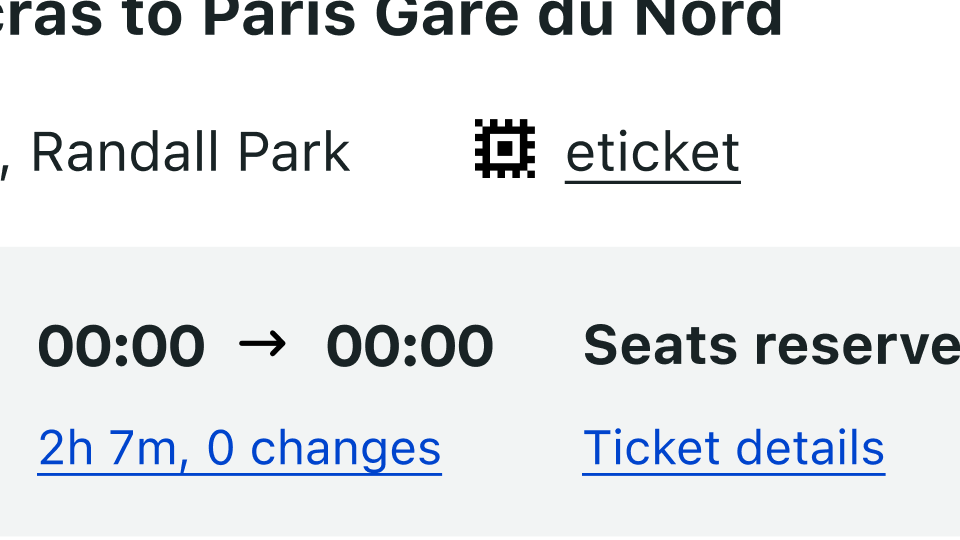
Standalone links are used on their own directly following content. They should not be used within sentences or paragraphs. Standalone links are the default link style for D-system and are all underlined in the normal state.
The standalone link component can be paired with an icon. Use 24px icons and place them to the left of the link mainly for interface usage or use 12px icons and place them to the right of the link for Extrenal linking usage. Icons should always be the same color as the link text.


Inline link
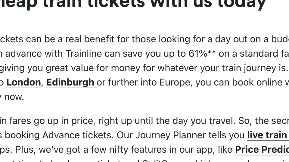
Inline links are used in sentences or paragraphs of text. The inline link behaves the same as the standalone link but it is styled with an underline. This helps differentiate them from the text they are placed next to and makes it clear users can interact with them.
Inline links can be used on their own and can be paired with icons. See style tab for more.


Visited style
By default, the link component use a visited style. Visited links indicate that a user has already opened the link so they can be a helpful indicator during task completion.
Visited styles can be used if it is important that a user knows they have already clicked on a link.
They should be used sparingly because they often clutter the page and add further visual noise as users are trying to navigate a product.
Links that trigger actions
Some links trigger actions to aid task completion in addition to navigation. These links should still serve a navigation purpose. A common example is linking phone numbers so clicking the website automatically opens and calls the phone number when clicked. The label and any accompanying icons should make it clear what action will be triggered and where the user will be directed.
Sizing
The inherit link uses 5 different sizes and 3 different weights.
The standalone links (found in interfaces) use 2 sizes, normal/body and small depending on its surroundings as well as regular weight.
In some cases and when it is needed the standalone link can act as an inherit borrowing the same values as the its inherit version.
Most common standalone links sizing


Inherit links sizing

Structure
Links can be grouped horizontally or vertically. The following recommended specs are not built into the link component but are recommended by design as the proper distance between grouped links.


Color

HEX #0044CD

inherits the color of its parent
Interactive states on white
All states share the same properties regardless the variant

States on layering model


States and dark theme

Theme colours
Do not use theming colors as backgraound colors butinstead use the theming color with the link itself to its default state.
If it is neccessary use white links instead apart from when the backgraound is #000000 where the main blue link becomes #78A3FF

blue_110

blue_110

blue_90

white

Avoid

Use

States and themes examples

Overview
Hypertext or link:
https://webaim.org/techniques/hypertext/
The purpose of each link can be determined from the link text alone or from the link text together with its programmatically determined link context.
WCAG reference:
https://www.w3.org/TR/WCAG20/#navigation-mechanisms-refs
Rationale
Link variants
This requirement ensures the purpose of a link is clear and easy to understand for all users. Whenever possible, the text of the link should describe its purpose without needing additional context.
Some assistive technologies provide a list of all links on the page to its user. If the text of the links do not clearly give the purpose, or if multiple links with the same name point to different targets (e.g., “read more”), users are forced to locate the link on the page and search surrounding information for context.
When it is not possible to provide descriptive link text, the content that provides the context must be in the same sentence or be associated with the link programmatically. Ideally, this descriptive content should precede the link, so that users who read content sequentially encounter the link context before the link.
Exception: An exception to this requirement is where the purpose of a link would be ambiguous to all users in general. For example, a game may create suspense for all users by presenting links with no indication of what the links will do until activated. However, whatever context is available must be programmatically associated with the link.
Note: In non-web software, a “link” is any non-UI-control text string or image that behaves like a hypertext link. See Applying WCAG to Non-Web Information and Communications Technologies (external link to WCAG2ICT):
https://www.w3.org/TR/wcag2ict/
Refer to Understanding 2.4.4 Link Purpose (in context) (external link to WCAG 2.1) for more information on exceptions, intent, benefits, and techniques:
https://www.w3.org/WAI/WCAG21/Understanding/link-purpose-in-context
Helpful resources for creating customized accessible implementationsW3C WAI-ARIA Authoring Practices Link Design Pattern covers the usage of ARIA names, state and roles, as well as the expected keyboard interactions:
https://www.w3.org/TR/wai-aria-practices/#link
Empty links
Empty links are links with no meaningful text or image alt text, like a social media icon inside a link block. This causes a confusing experience for people using assistive technology.
Non-descriptive link contentLink text should be unique, make sense without the surrounding text, and tell readers what the purpose of the link is and where it will take them.
To fix this, make sure all the link elements on your page have meaningful, descriptive text inside.
Avoid generic terms like “read more,” “link,” or “click here.” Though the Audit panel doesn’t provide guidance on generic terms, use clear, specific language about the action the link performs to make your link that much easier to use (e.g., “Download assets”).
You can also use assets that don’t have text rasterized with the image. Instead, place text elements over your image assets.
Remember, if you have image links (like icon buttons), be sure to include alt text for those as well. Update the link by adding alt text for the image/icon
Include a "skip to main" link Keyboard users use the “Tab” key to navigate from link to link on a web page. Without a “Skip to main” link (sometimes referred to as a “skip navigation link”), users are forced to tab through every link in a navigation bar before getting to the main content.
Make sure that your skip link is working, and that after pressing the “Tab Key”, the focus continues in your chosen main element.
WCAG reference:2.4.1 Bypass Blocks https://www.w3.org/TR/UNDERSTANDING-WCAG20/navigation-mechanisms-skip.html
States
None state
The None state is the default state of elements. This is how the element looks by default.Once you choose and style another state, you can return to styling the default state by choosing “none” from the States dropdown menu.
Hover state
The hover state shows when you hover your mouse pointer on an element. It’s not possible to hover on most touch devices so be aware of this when designing for smaller breakpoints.
Pressed state
The pressed or active state is the state that shows when you click or press on an element. This state inherits styles from the hover state as pressed is actually a state of the hover state.
Focused state
You can focus on certain interactive elements, like buttons and links, without activating them by using your keyboard to tab into them. Clicking interactive elements with your mouse or pointer device both focuses and activates them. This state emulates when an interactive element is focused with either your keyboard or mouse or a finger tap.
Focused (keyboard) state
Like the focused state, this state emulates when an interactive element is focused but not necessarily activated (e.g., by tabbing into the element with your keyboard). Note that it always applies to text input fields when focused, regardless of the manner in which they were focused (e.g. with a mouse, a keyboard, etc.).
In order to make your site more accessible to visitors who rely on a keyboard for navigation, it's important to style this state so interactive element locations are obvious on the page. We suggest setting an outline on interactive elements because it will not affect the layout of the element.
Visited state
The visited state is the state of a link that's been visited. This state inherits styles from the none state.For the visited state, you can only style the text color, the background color, and the border color. The background color will only appear if it is already set in a different state.


