Icon


.svg)


Icons are visual symbols used to represent ideas, objects, or actions. They communicate messages at a glance, afford interactivity, and draw attention to important information.
System components typically use icons on 24px artboards and 32px artboards can also be used within the UI. Be sure icon size is consistent throughout your product.
Common usage
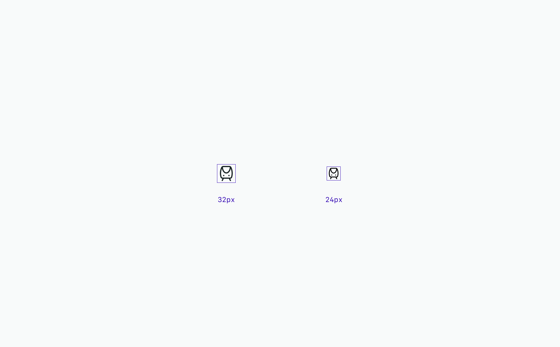
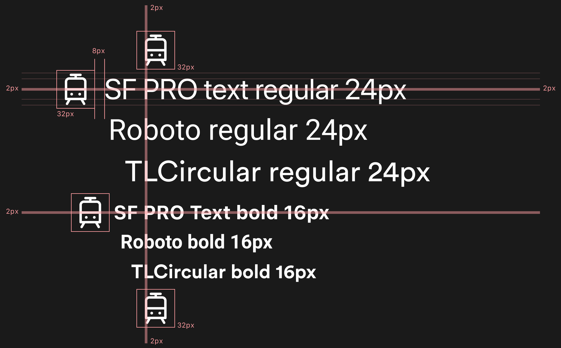
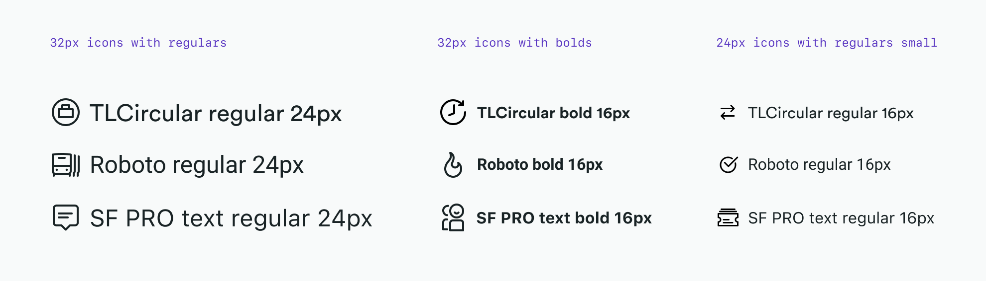
32px icons are optimised to feel balanced when paired with 24px regular and 16px bold TLCircular, SF PRO text regular and Roboto
24px icons are optimized to feel balanced when paired with 16px regular TLCircular, SF PRO text regular and Roboto
Addaptive usage
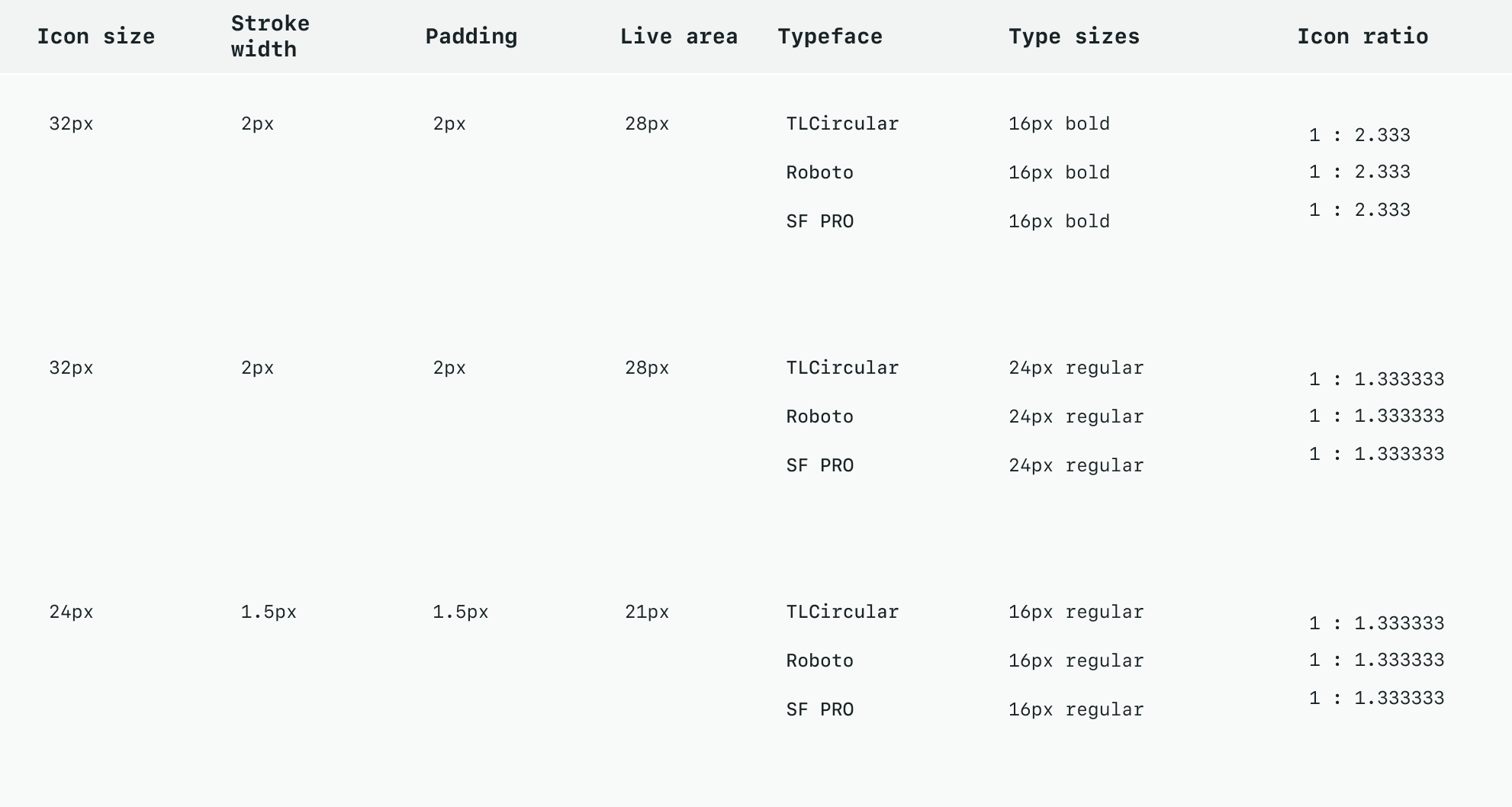
The way icons should be used is closely related to the font weight. Regular fonts should be bigger to much the bold ones as the main stroke size or type thickness should match if not to a perfect ratio then the closest possible.

Do use the correct icon size:
1:1.333333 Ratio for regular
1:2.333 Ratio for Bold

Do not use the same size as the font size:
1:1 Ratio
Do use the correct icon-text size ratio.
Do not use the same size as the font size
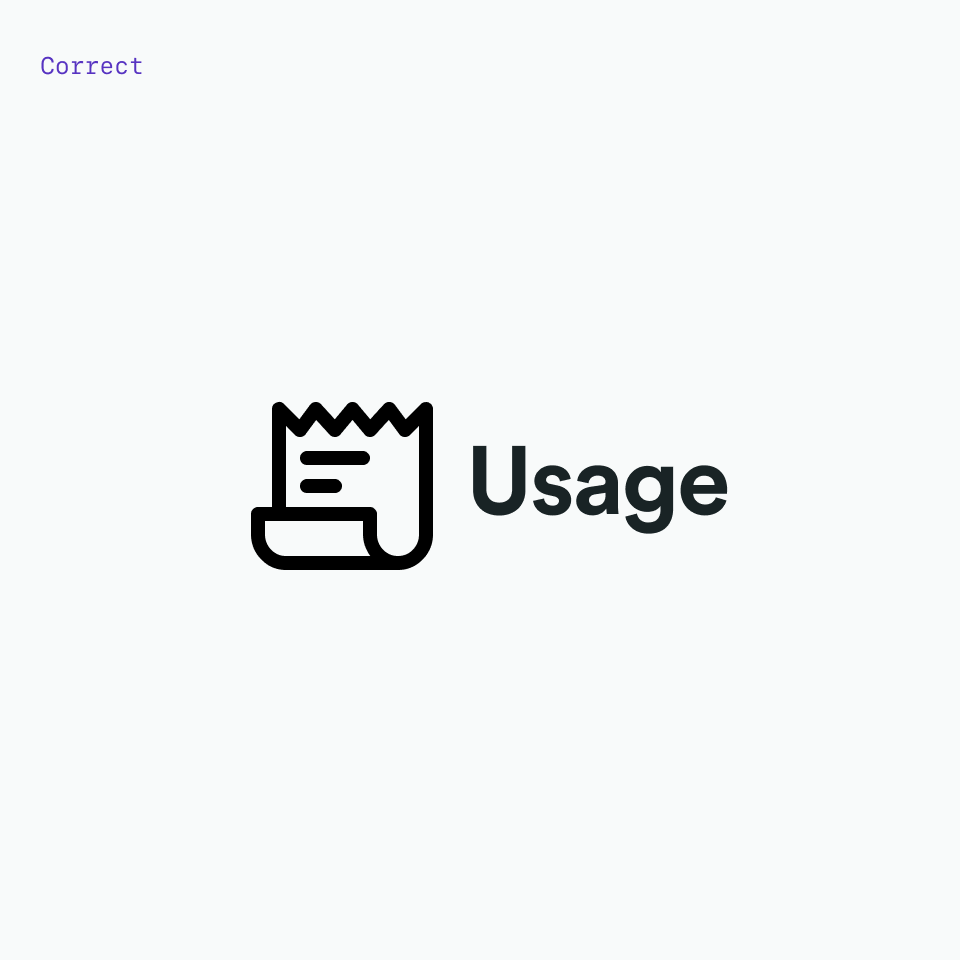
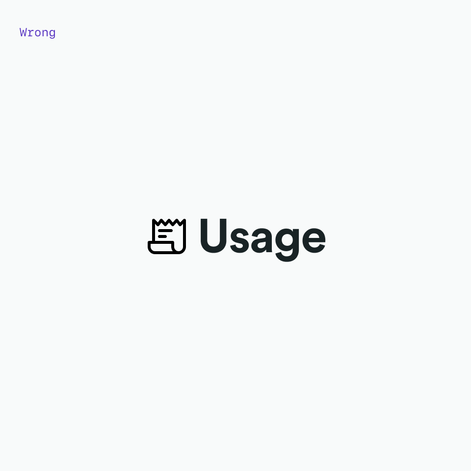
Color
Icons are always a solid, monochromatic color and need to pass the same color contrast ratio as typography (4.5:1). The color of the icon should reflect the importance of the icon’s action which should always be to help guide a user.
It’s also important to note that icons themselves do not have interaction states.
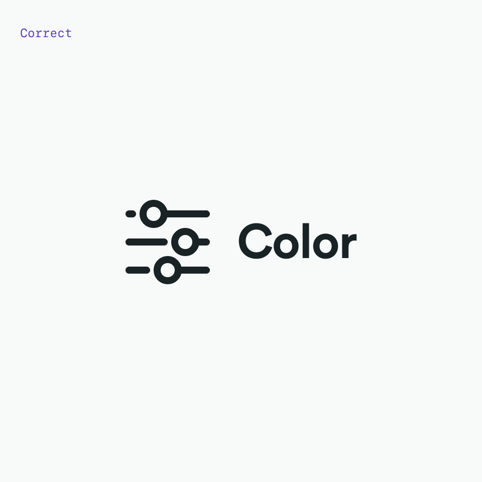
Do match your icon color with your text color when pairing them.
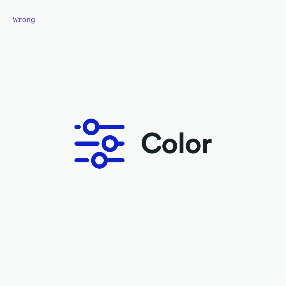
Don’t use different colors for text and icons.

Do make icons monotone.

Don’t use more than one color within an icon.
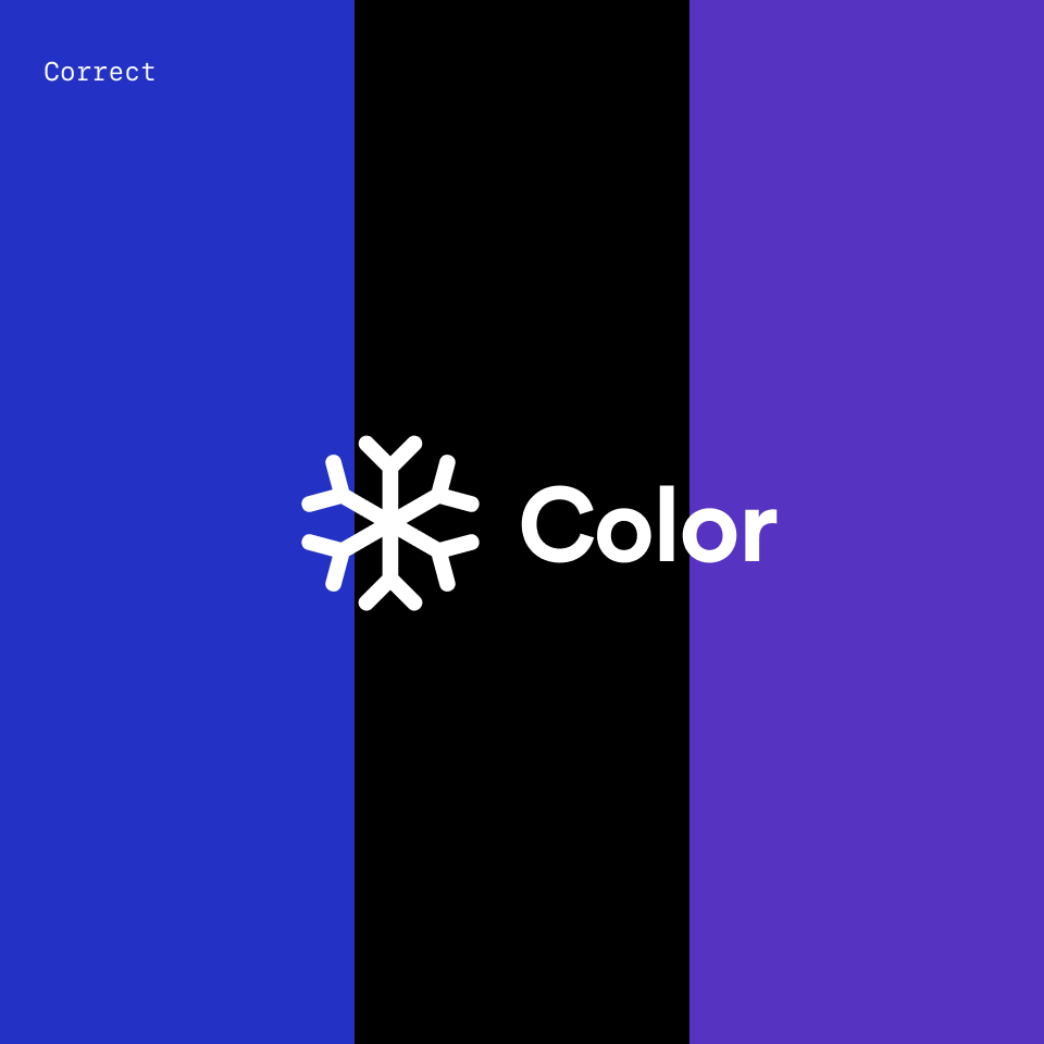
Always use white on dark backgrounds

Do not use color on dark backgrounds
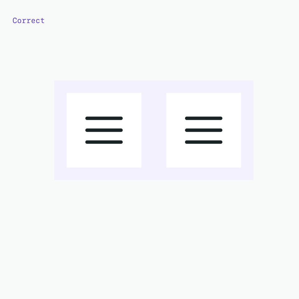
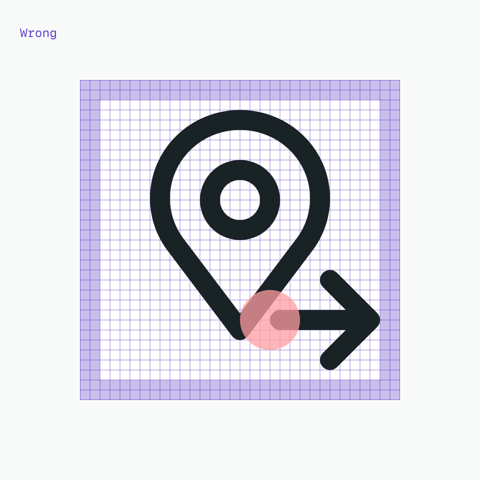
Alignment
When used next to text, icons should be center-aligned.
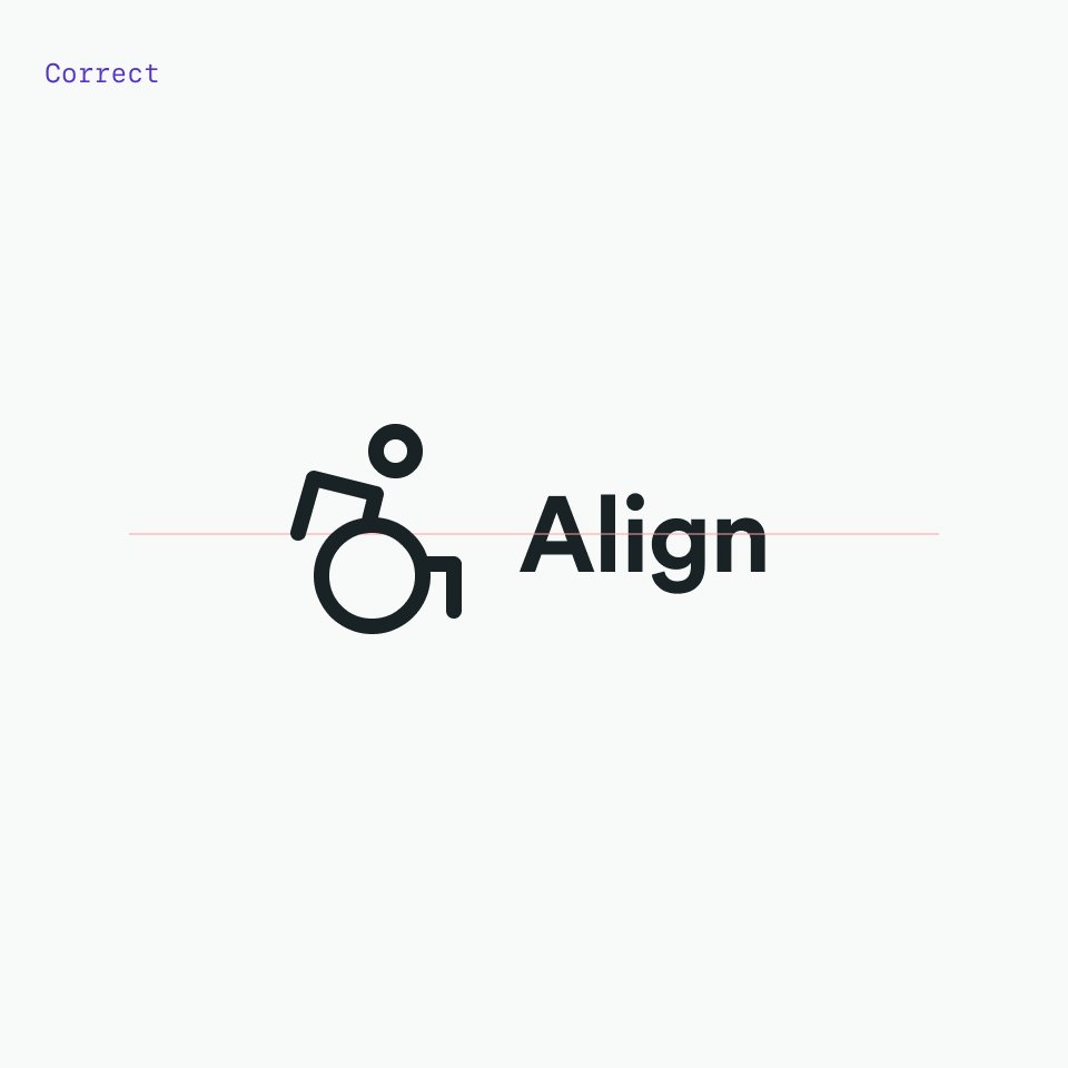
Do center-align icons when they’re next to text.
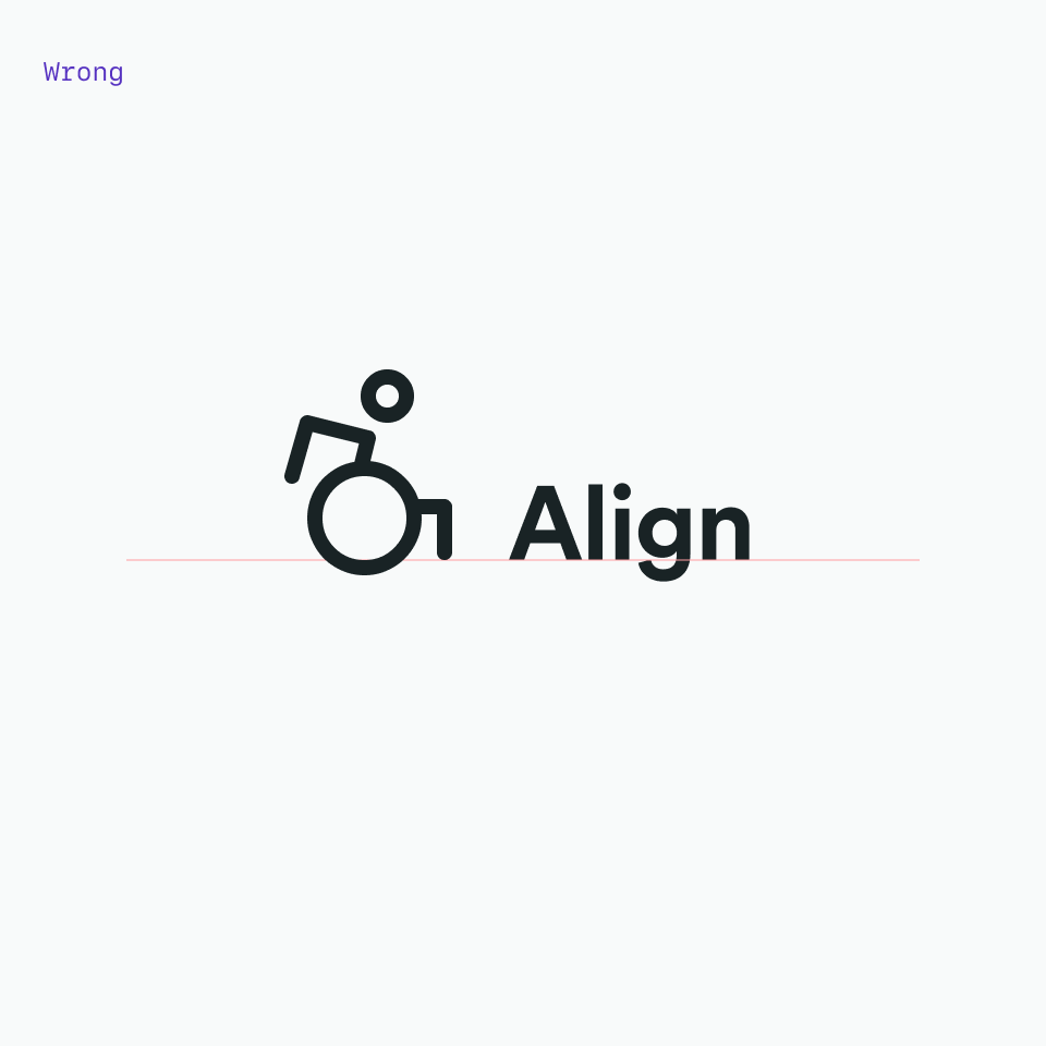
Don’t baseline-align icons to the text.
Icons are optically aligned to the center of the icon grid within the boundary box. Centering ensures all icons will be aligned correctly when exported and used side-by-side in a line or a row. Visually center an icon where the visual weight is heaviest. In some situations, mechanically centering doesn’t work.
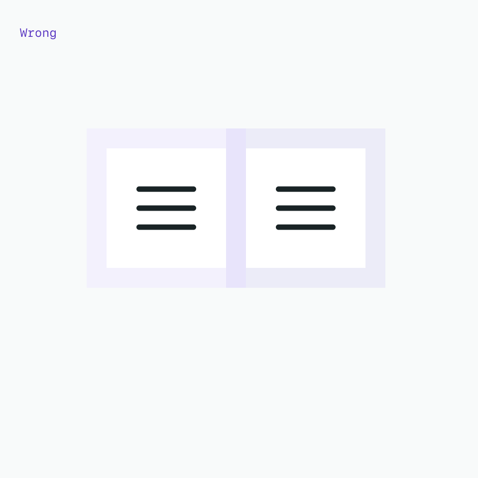
Distance
When used next to text, icons should be 8px away from it
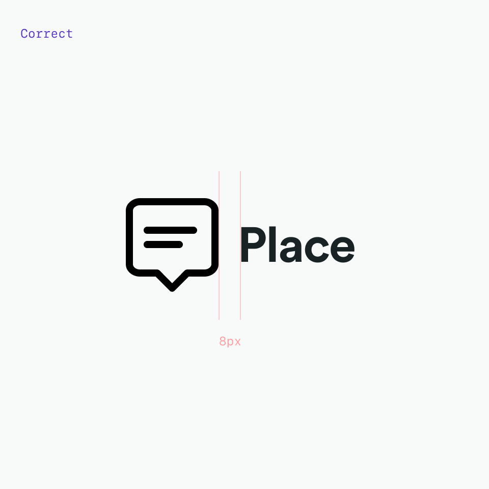
Always use 8px space after the icon and before the text

Never use less or more than 8px after the icon and before the text
Positioning
When used next to text, icons should be always at the beginning
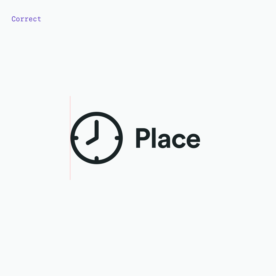
Always use icons before texts

Do not use icons after the text
Touch target
All touch targets for interactive icons need to be 44px or larger. Developers can add padding to a touch target with CSS to meet the 44px requirement.
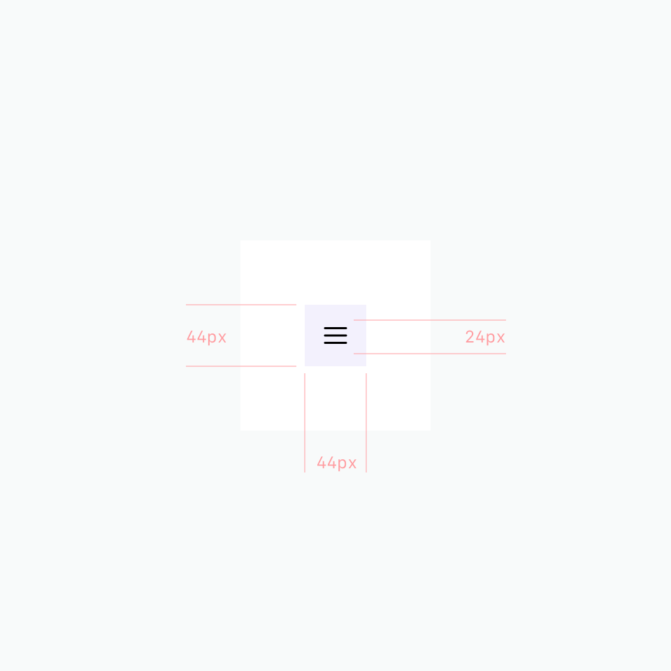
A 24px icon centered in a 44px touch target.
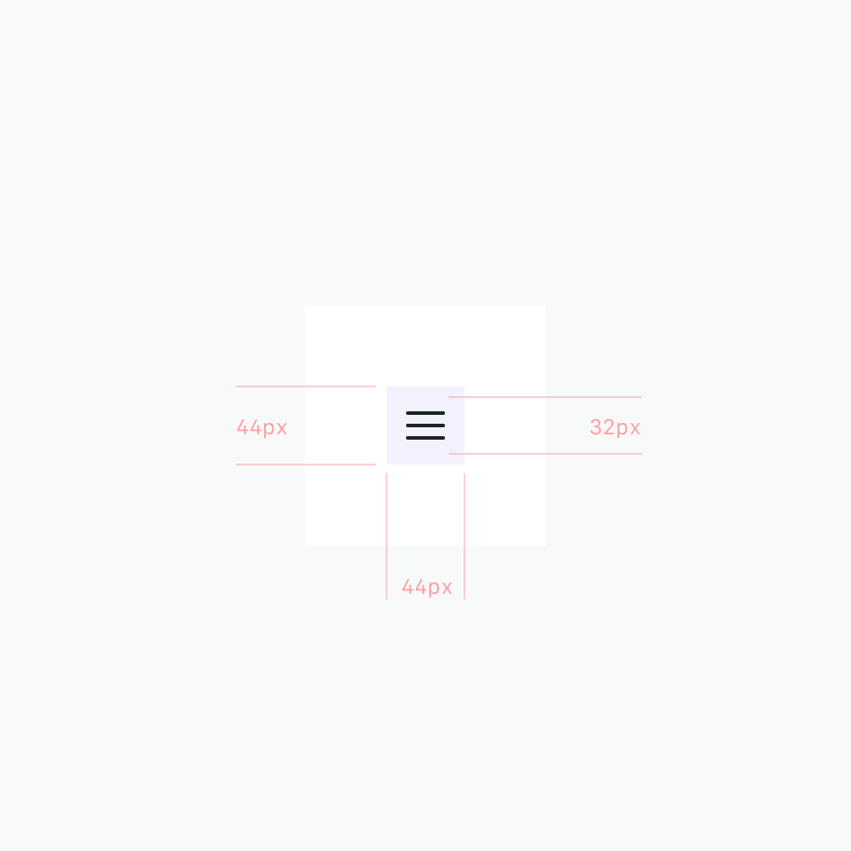
A 32px icon centered in a 44px touch target.
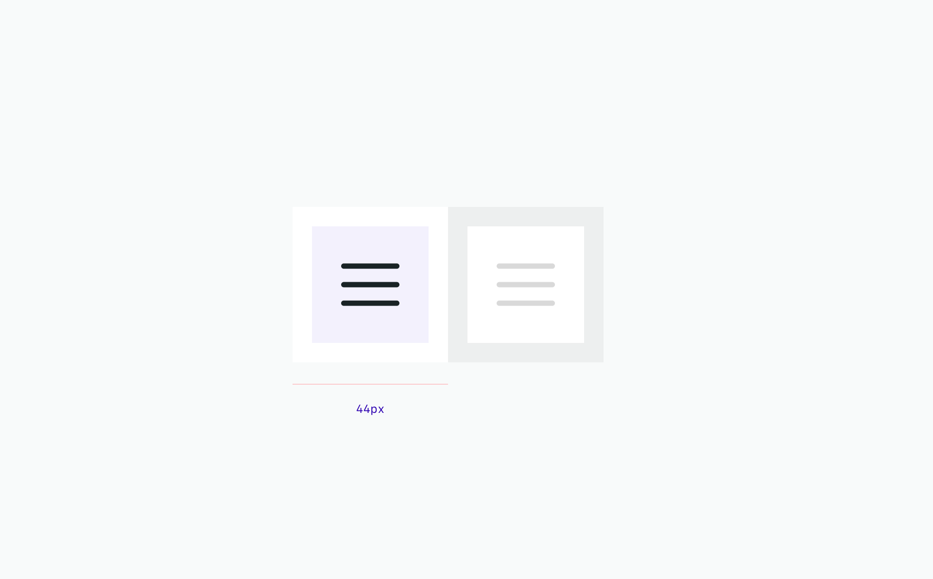
Do follow the clearance rule to allow for legibility and an optimal touch experience.
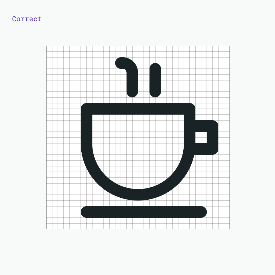
As visual symbols, D-system icons represent ideas, objects or actions. They can communicate messages at a glance, afford interactivity, and draw attention to important information. Based on details from the typeface, they work well at small sizes.
Foundation
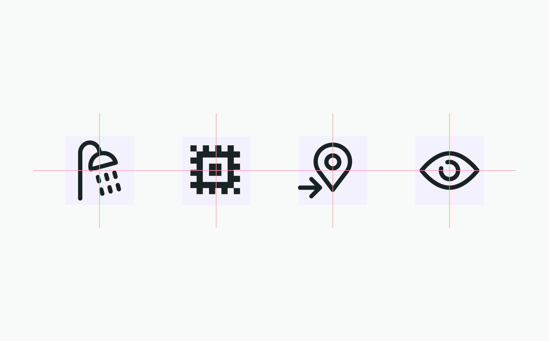
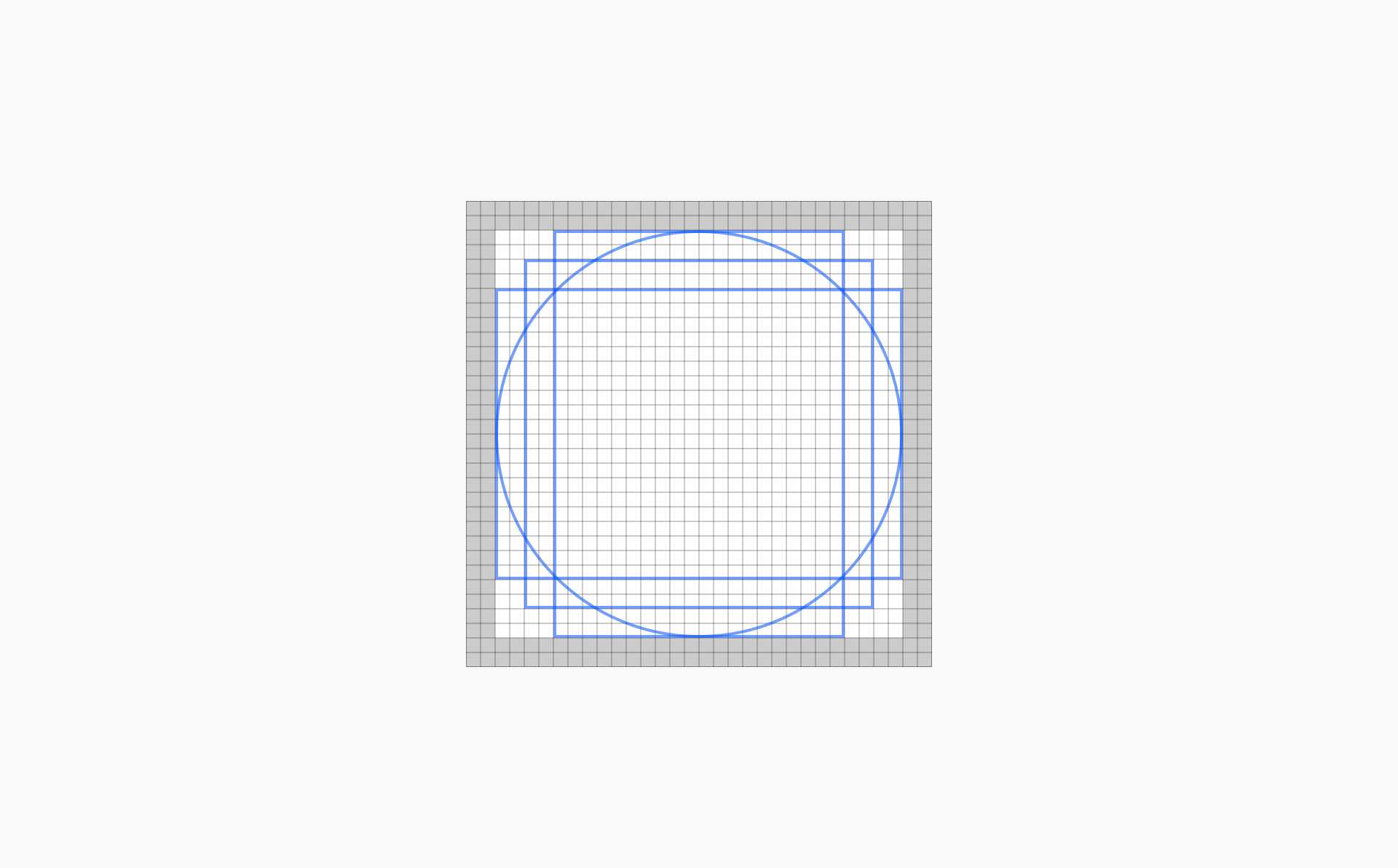
The square grid is the underlying fabric of all D-system icons and is used as the foundation to determine line thickness, proportion, shape and positioning across the entire set of icons. The grid helps guide design decisions, which helps ensure a unified approach. More importantly, it allows flexibility in creating the appropriate shape needed to communicate the right idea
Base grid
D-system icons are drawn on a pixel-based grid of 32px x 32px and scaled down linearly to different sizes. Use the grid as your basic guideline to snap the artwork in place. We recommend fine-tuning adjustments for the shape you are trying to achieve during creation.
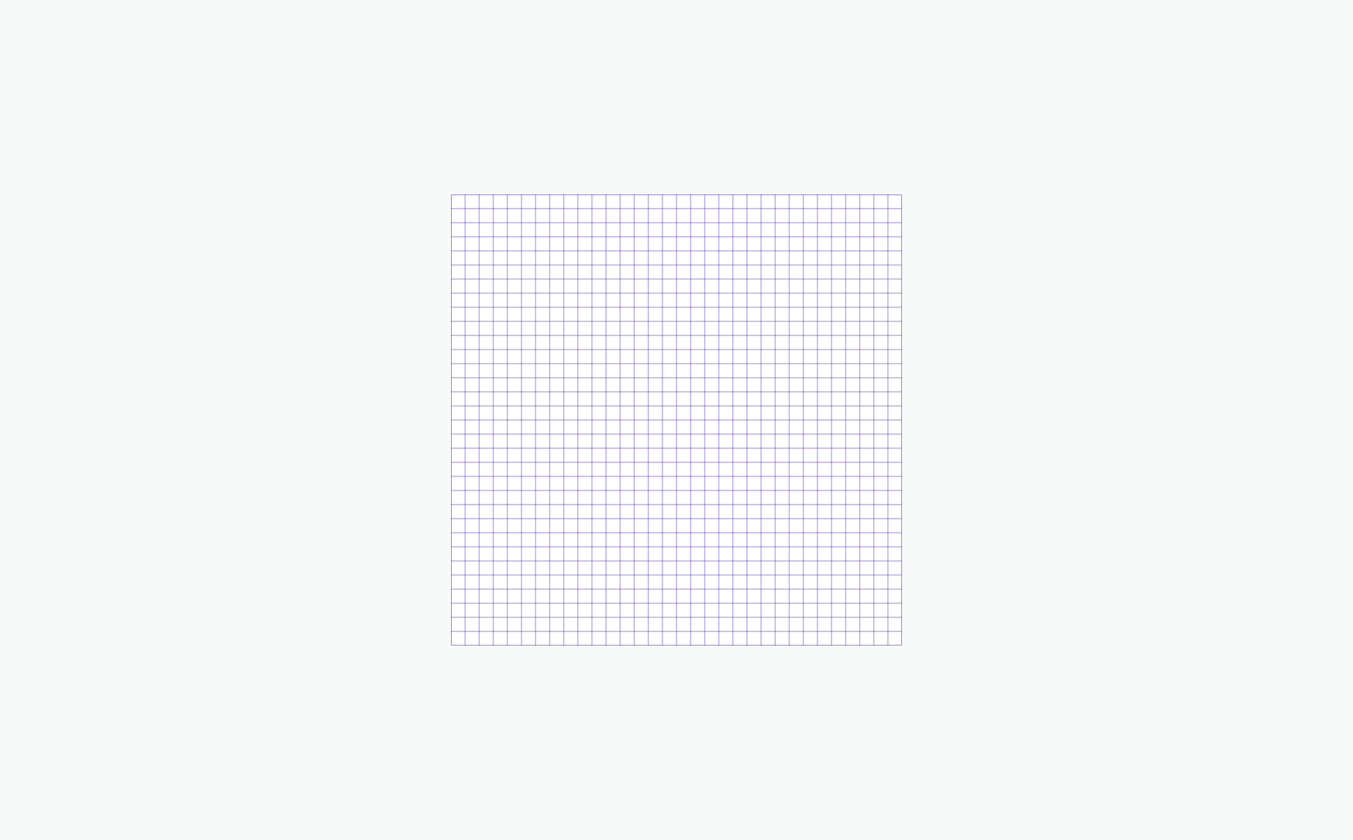


Align design elements by snapping to the pixel grid.

Avoid random decimal points in the x- and y- coordinates.
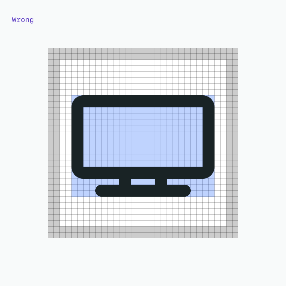
Padding
The grid contains 2px padding. This ensures icons will retain their desired scale and surrounding white space when exported. Only extend artwork into the padding for additional visual weight or for specific details required to define the shape’s content, meaning or character.
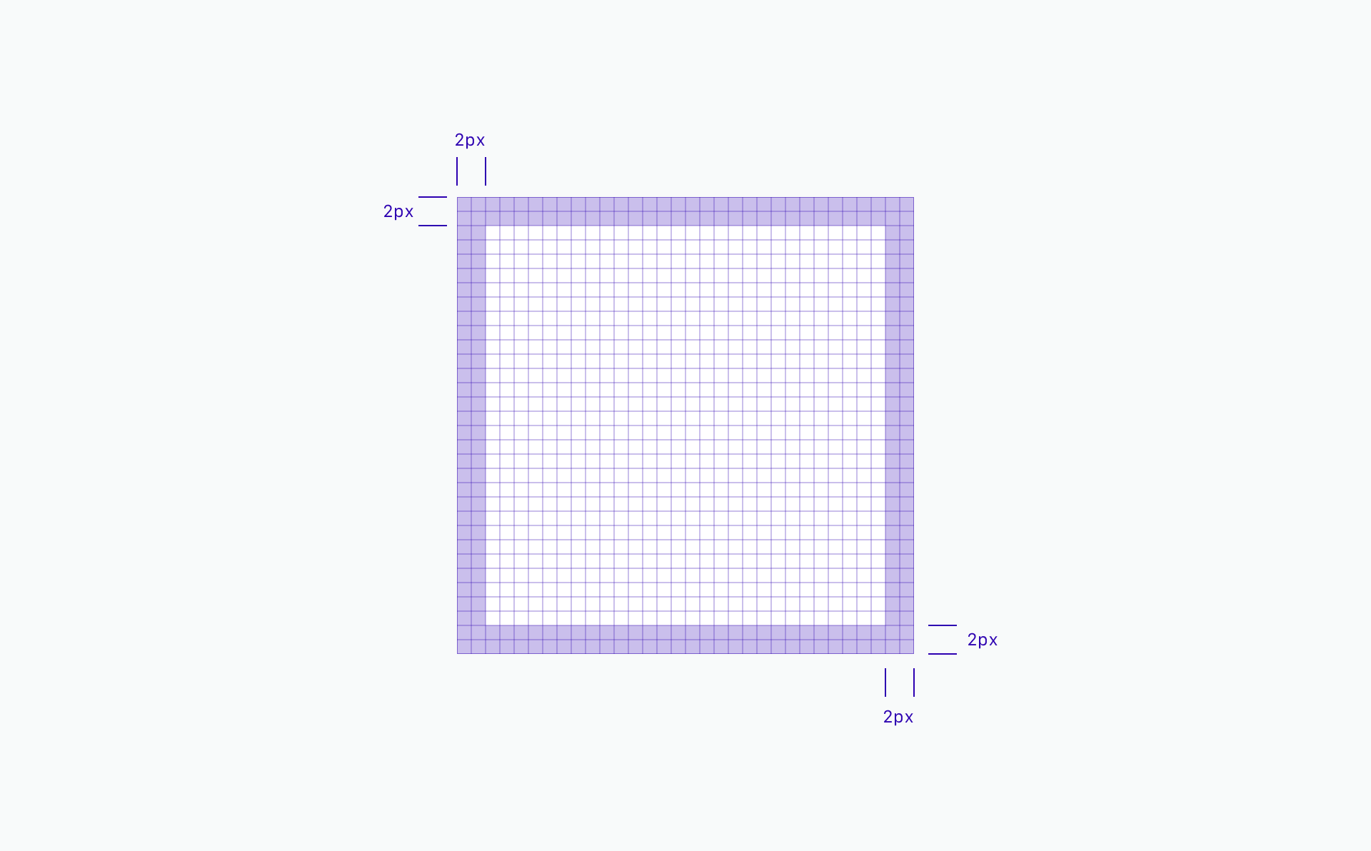

Icon should remain inside the padding.
Avoid placing part of the icon in the padding area.
Do extend icons into padding if additional space is needed.
Don’t crowd the design elements—make sure there is enough space between them.
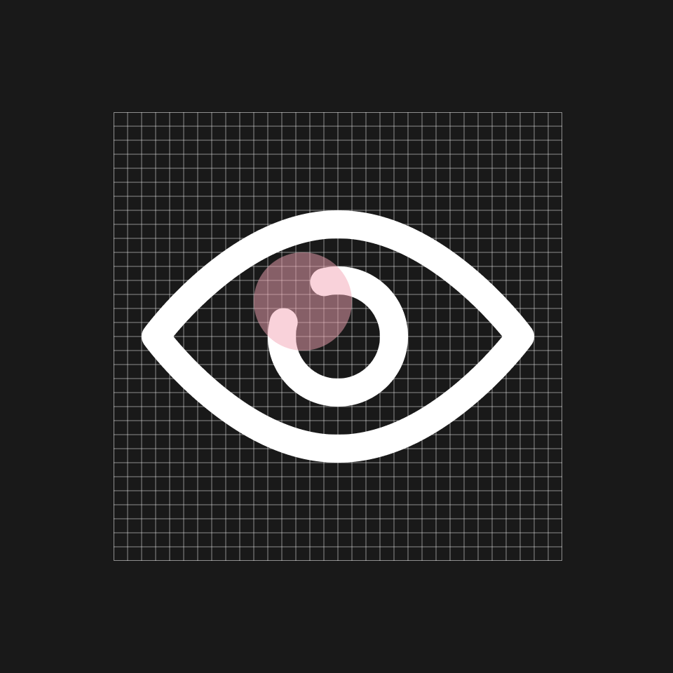
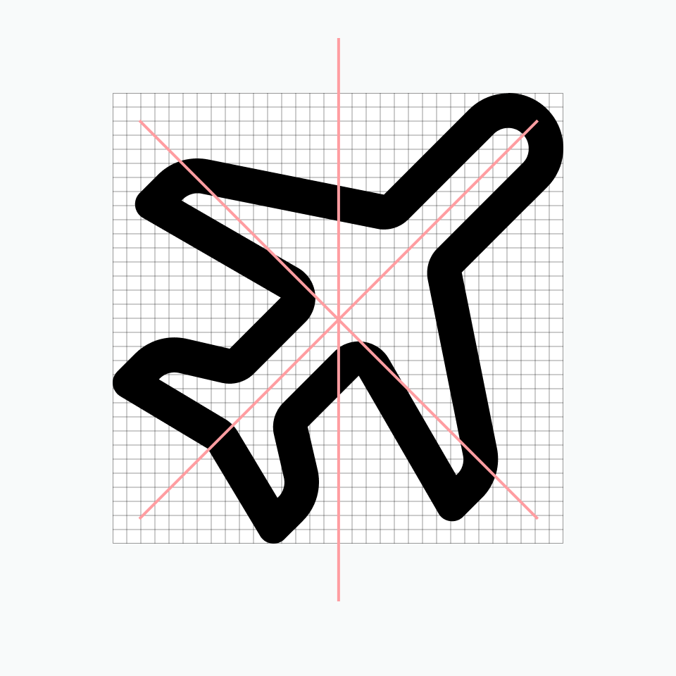
Keyshapes
Key lines give you consistent sizes for basic shapes or proportions across the icon set. This makes it easier to create a visually stable foundation and helps to establish relationships between the similarly proportioned icons and the objects or ideas they represent.


Do extend content beyond the keyshapes for proper form if needed.
Don’t force the content to fit inside the keyshape.
Style
The stylistic conventions of D-system icons deliver a meaningful bond with our typefaces: TLCircular, Roboto,SF PRO Each icon is intentionally designed to harmoniously pair by sharing distinct details and characteristics found in the letterforms. The examples below demonstrates some of these relationships between icons and letters which allows them to family well together visually.
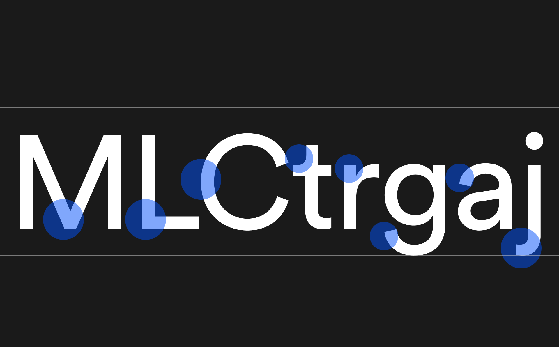
Size alignment
Details
Rounded exteriors with corners interiors

Round terminals
Playful details

Universaly recognised
Strokes
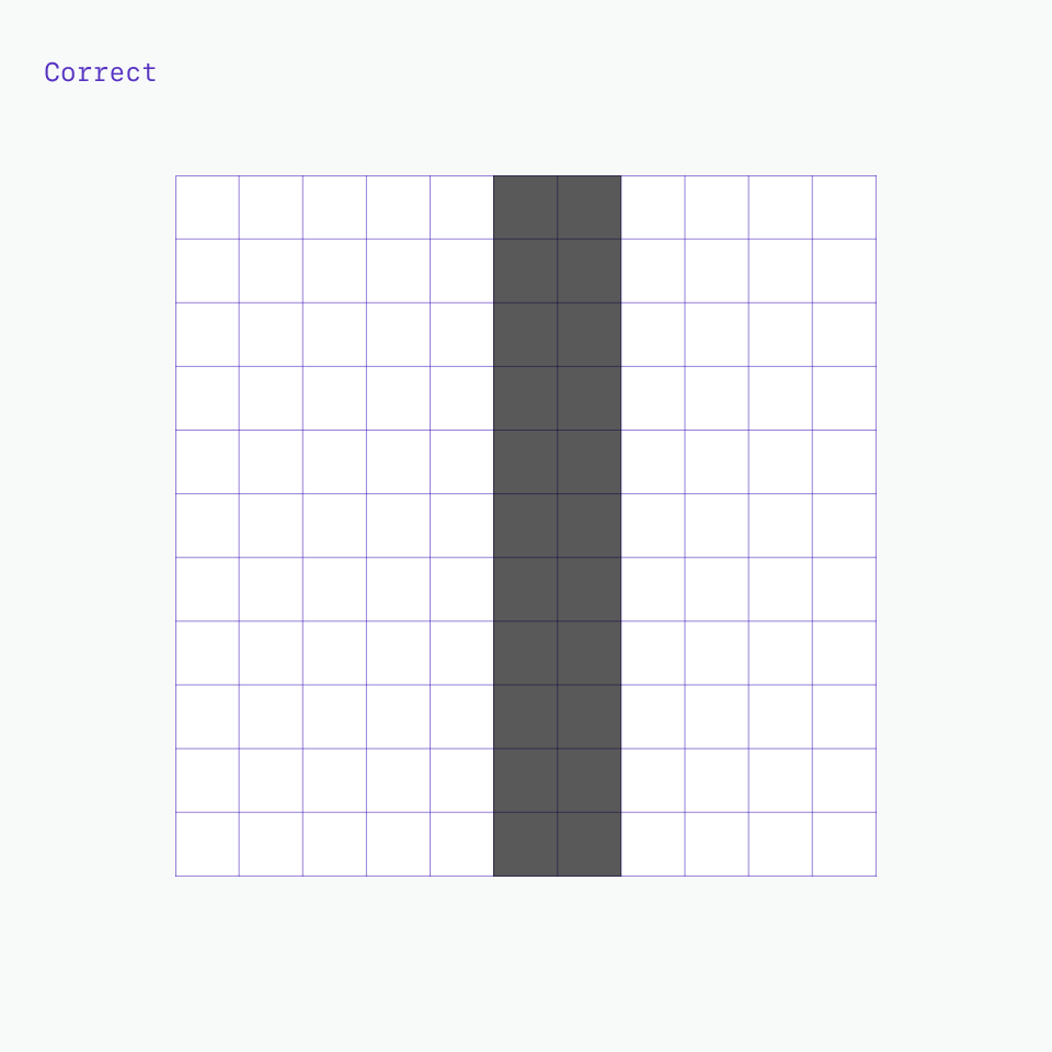
One icon should not look heavier or lighter than other icons of the same size. Nor should there be different weights within one icon. Maintain the same visual weight by using a 2px stroke for all icons. There are a few exceptions to this rule which occurs when the icon is complex or has a certain density of line.
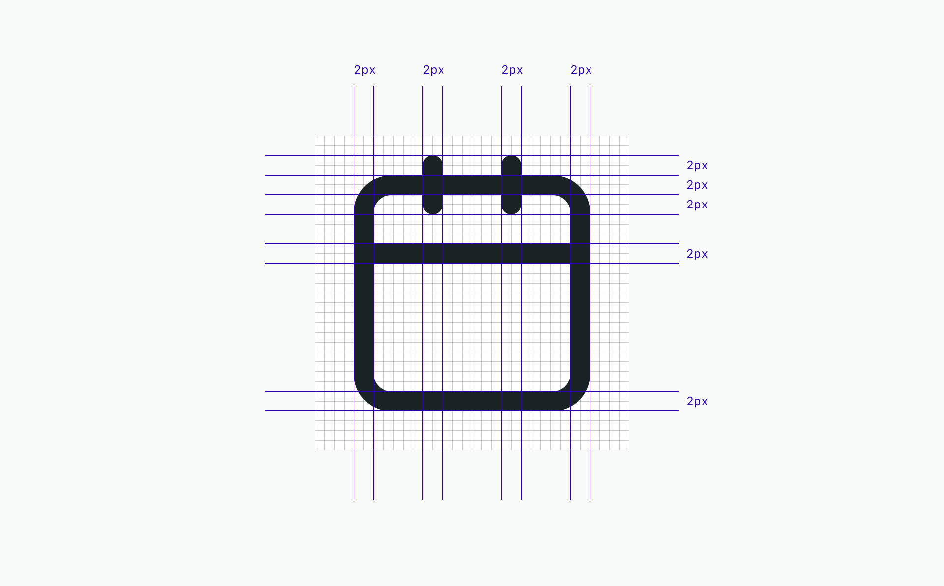
Do be consistent with 2px stroke weights.
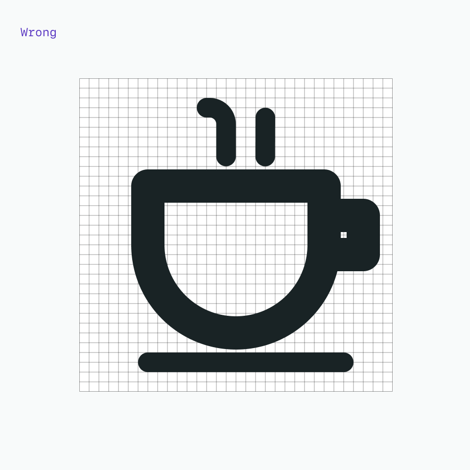
Don’t use inconsistent stroke weights. They’ll feel unbalanced and look like a mistake.

Do use a 1.5px stroke in instances where complex details are unavoidable.
Don’t make icons feel visually heavier than the rest of the set.
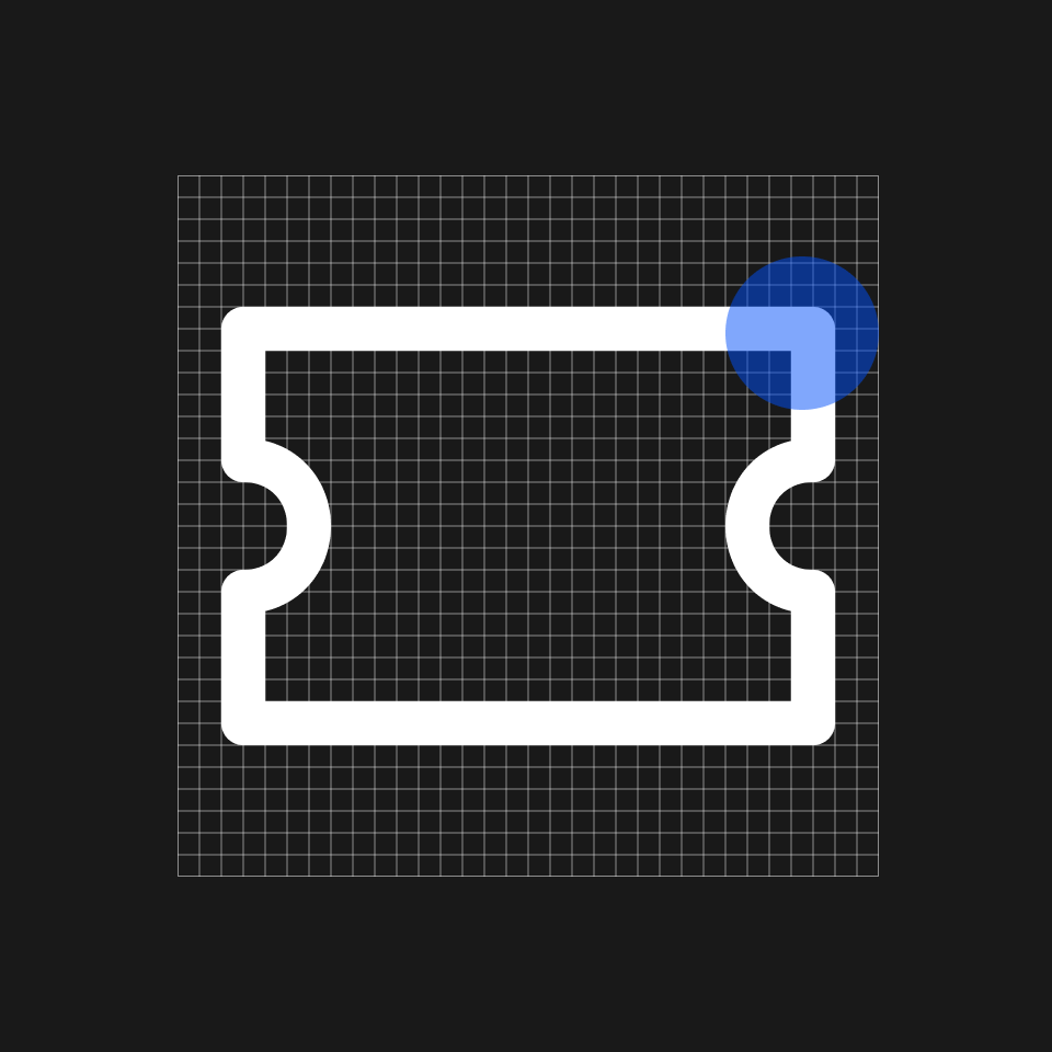
Corners
Use a consistent corner radius of 2px for rounded shapes. The 2px radius can be increased by a multiple of two when necessary to make the icon’s metaphor understandable or object shape clearly defined. Use an additional radius to make the metaphor reflect the real form of the object.
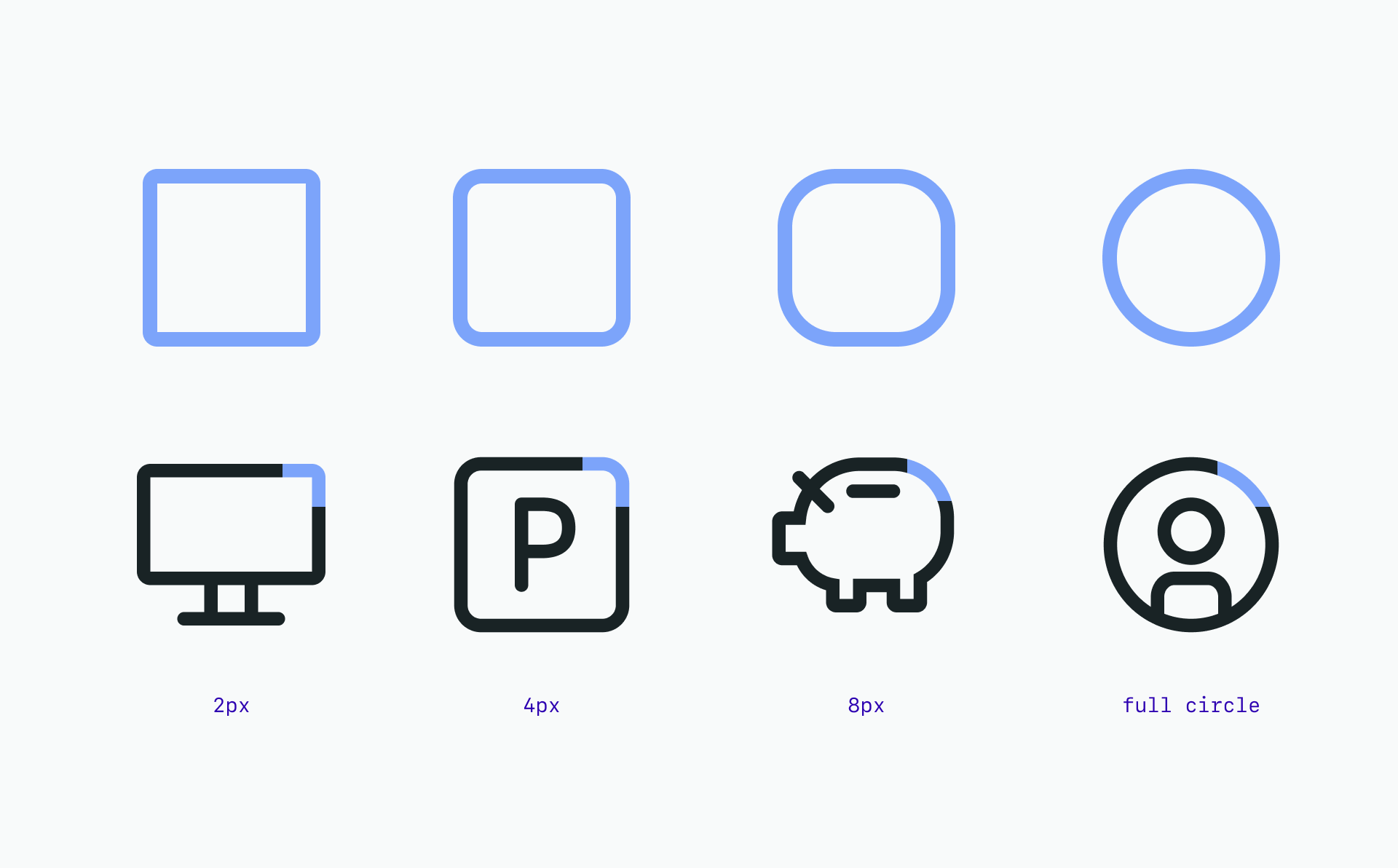
See border radius for more

Do use squared corners when needed to reflect the real form of the metaphor.

Don’t force rounded corners if they don’t work for your metaphor.
Angles
Use 45° angles for even anti-aliasing. Use increments of 15° whenever possible for other angles needed to best depict the shape you’re creating for your metaphor. You can create harmony across the icon set by consistently making angles sit on the same increments.
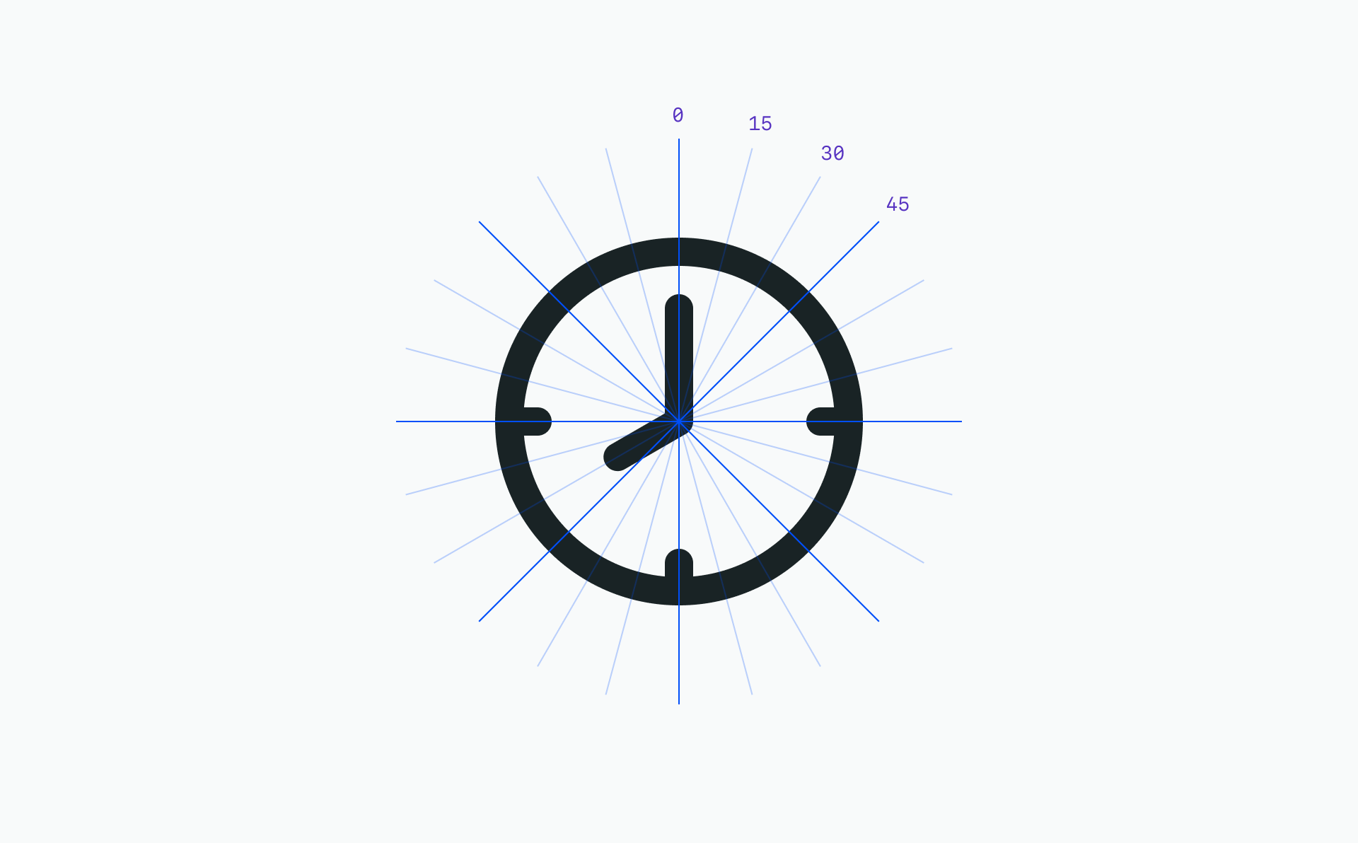


Do use multiples of 15° or an angle that best represents the metaphor when necessary.
Don’t use 45° angles exclusively for all icons. It won’t work.
As visual symbols, icons represent ideas, objects or actions. They can communicate messages at a glance, afford interactivity, and draw attention to important information.
Design and production guidelines
Don’t see the icon you need in the library? Make your own! Follow these guidelines to ensure visual consistency and proper formatting.
All icons should be unique and not redundant with any existing icons in the system. Search the library for the keyword(s) associated with your proposed new icon to ensure that it is not already represented.
All icons should adhere to the D-system Design Language visual style.
All icons should comply with D-system accessibility standards.
All icons should be usable across all supported platforms and devices.
All icons should be understandable by a global audience of users, regardless of nationality or language.
Making an icon
Create a 32px x 32px artboard for each icon.
32px icons should have 2px padding.
Set your workspace up from the start to snap to pixels and round values to whole pixels to avoid correcting shapes later.
Never use center borders. Centering can cause half pixels.
Avoid using the line tool; use the rectangle tool instead. The line tool will place the vector on half pixels.
Be aware of automatic alignments which can place vectors on uneven or half pixels.
Ungroup icon layers completely; The icon should be on the top-most layer in your artboard.
Make sure to properly name layers and artboards; These names will also be exported into the code.
Production-ready
To be considered production-ready, all icon submissions must be delivered in SVG format at 32px x 32px for integration with D-system components.
Icons should be at whole pixels. No decimals are allowed in x and y coordinates or width and height fields
Each artboard and the artwork within it must be aligned to the pixel grid
All strokes must be expanded and at full pixel values
All possible shapes and paths should be combined
Exporting SVGs
Draw a 32px x 32px artboard. 32px icons should have 2px padding.
Place the icon squarely on the artboard, making sure it’s aligned to the pixel grid.
Expand all strokes.
Select all overlapping shapes and Unite them in the Pathfinder panel to merge all of the shapes together.
No BG color between, in and overall.
Make sure the icon is at #192325 and has no additional styling.
Select export.
On the Format dropdown select SVG.
Contribution process
Does your icon have potential for other products at D-system? If so, please consider contributing to the design system. D-system welcomes icon contributions to our iconography library. You’re welcome to submit a single icon or a batch of icons for approval.
Getting started
Before submitting artwork, first review our icons library or download the file to check your design for duplication against existing icons.
Approval process
Icons for use within D-system must go through a design review process to ensure consistency and proper representation of the D-system brand across all environments. The process begins when you create a Proposal. Design review and approval typically take 14–21 days from proposal review, depending on the number of icons contributed.
If your submission is accepted, the team will assign someone to your issue. If changes are needed, the team will note them in the proposal and may return your submission with recommendations or suggest reworking the icon based on feedback from the Design System and Brand teams.
Once the submission is approved it will then go through our process to be included into the Icon master file and be made available in the D-system Design Language and D-system libraries.
Submit icons for approval by creating a proposal for your contribution.
Alt text describes images and icons to visitors who are unable to see them. This includes screen readers and browsers that block images/icons, but it also includes users who are sight-impaired or otherwise unable to visually identify an image.
Decorative images/icons
Images that are not necessary for comprehending or engaging with the content are considered decorative. Decorative images should be marked as decorative or screen readers will guess a description, usually speaking aloud a sometimes cumbersome filename like “hero-image_293_version_953”.
See W3’s alt text decision tree to help determine whether an image is decorative.

How to write good alt text
Writing good alt text is an art! Making sure every image/icon is either set as decorative or has alt text is the baseline, but there are also some nuanced considerations when writing effective, contextual alt text:
Include alt text for every important image/icon you upload.
Avoid repeating surrounding text: if the appropriate alt text for an image/icon is already included in surrounding text, mark the image/icon as decorative.
Leave out the words "image", "picture", “icon” — screen readers already say this.
Keep it concise — 150 characters is a good starting point.
For complex images/icons, briefly describe in the alt text, and also include a more complete text description either on the page or linked elsewhere.
The alt text for actionable images/icons, like image/icon links, buttons, or image map areas, should clearly identify the link destination or button purpose.
Context matters: write a concise description that calls out important visual features that made the image/icon important to include.
Examples: how context changes alt text

Depending on the context that the image is presented in, there are many different options for good alt text.
Example 1:
Surrounding text: Safety at night is a concern for both library staff and patrons. A well-lit walkway can be an attractive feature drawing patrons in throughout the evening.
Alt text: A modern glass, steel, brick and wood library building with artificial light shining from 1.5 story windows and from spot lights placed in a wooden architectural soffit. The sidewalk is well lit.
Example 2:
Surrounding text: XYZ Library obtained Silver LEED certification in 2011. The library features energy efficient windows and shades. The airlock at the main entrance is also a feature which is helpful in the Boston climate year round.
Alt text: A modern glass, steel, brick and wood library building with a double door airlock connected to a room with desks and shelving visible from outside. This room has floor to ceiling 1.5 story windows with long shades.
Icons
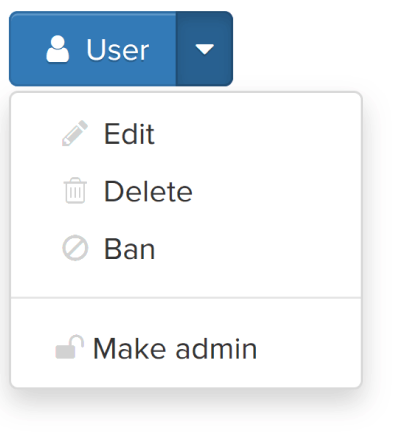
Many of our web pages use icons to supplement or replace text. Complex content and functions, such as clicking a gear icon for "settings", can easily be conveyed through a very small icon. Icons should be simple, easy to understand, and consistent. Icons almost always require familiarity in order to be useful. Across cultures and languages, they can be misinterpreted. In many cases, adjacent text is helpful.
%201.png)
In this example, since the adjacent text conveys the content of the icons (and is presumably contained within the same link as the icons), the icons should have alt="" so they are not identified separately.
Hide decorative elements with an aria attribute
Add the following as a new Custom Attribute:
Name = aria-hidden
Value = true
Useful resources:
Aria hidden focusUsing aria-hidden="true" on Unicode characters that AT should ignore
WCAG reference:
1.1.1 Non-text content
Contrast
Icons that convey text must present that text with sufficient contrast. Text contrast within images is particularly important if the image is of low quality or when the image is enlarged.
Check the contrast for all icons
Icons need a contrast ratio of at least 3.0:1 against background colors.
Useful resources:
Check the color contrast of your icons and learn more about best practices with these excellent color contrast tools:
Color Contrast Analyzer (Chrome Extension)TPG’s Color Contrast Analysertanaguru contrast finderWebAIM’s Contrast CheckerColorable
A11y project reference:
Check the contrast for all icons
WCAG reference:
1.4.3 Contrast (Minimum)
Non-text Contrast
When elements other than text convey meaning, the perceivability of these elements is just as important as the perceivability of text.
For this reason, WCAG 2.1 Success Criterion 1.4.11 (Level AA) requires that graphical objects and author-customized interface components have a contrast ratio of at least 3:1. This applies to elements such as
icons
components of charts and graphs
buttons
form controls
focus indicators
and outlines
Low-contrast icons accompanied by text
This contrast requirement applies to graphical content that is required for understanding—icons, charts, graphs, etc. In this illustration, since the icons are accompanied by contrast-conformant text, the 3:1 requirement for the icon does not apply. The text (which must meet the 4.5:1 contrast requirement for text) is conveying the meaning and the icons are just enhancements.
SVG
SVG (Scalable Vector Graphics) appear to be the future of web graphics. As a vector-based, XML formatted image, SVGs are not dependent on resolution and are easily re-sized without degradation. SVGs can be easily manipulated and animated with CSS and/or JavaScript. SVG is thus great for responsive design and decreases page load time (as opposed to using JPG, JPEG, PNG, etc.). While SVG is not entirely supported by some IE browsers and Android/Windows phone native browsers, indications are that it likely will be soon.
Best PracticesSVG included in an img tagIncluding an SVG in an img tag is no different than including a regular image–always use an alt tag for SVGs that are important!
Additionally, since SVG is new type of image format, you must also include an ARIA role='image' since some screen readers will skip over the alt tag for SVGs without that role (specifically iOS VoiceOver).
<img src='/images/blue-triangle.svg' role='image' alt='Blue Triangle'/>
If the SVG is decorative, use an empty alt=''. If you do not, a screenreader will read the source tag which sounds awful.
<img src="/assets/images/frequent-flyer.svg" alt='' role='image'/>
Inline SVG
In the output XML for the SVG, include a title tag directly below the svg tag.
The <title> tag for an SVG should be brief, much like an alt attribute for an image.
In the SVG tag, include an aria-labelledby attribute that points to the <title> tag.
If there is more than one shape, it can be a good idea to include a title tag for each shape group.
Including a <desc> tag (description), in addition to a title tag, is very helpful for users of assistive technology.
On his site, Dudley Storey writes that ’<desc> is a longer description of the SVG element, containing its purpose or design.’
Example of desc tag: ‘Bar chart showing company sales by country, in millions of dollars (US).’
If your inline SVG is decorative, however, you do not need to include any of these attributes.
<svg aria-labelledby="title"><title id="title" lang="en">Red Rectangle</title><g><rect x="0" y="0" width="100" height="50" fill="red" /></g></svg>
Target sizes
Ensure target sizes are at least 44px
Make sure touch controls like hamburger menus, social icons, gallery viewers, etc. are usable by a wide range of hand and stylus sizes. This doesn’t include footnotes or icons in or at the end of a sentence.
Make sure touch controls like hamburger menus, social icons, gallery viewers, etc. are usable by a wide range of hand and stylus sizes. This doesn’t include footnotes or icons in or at the end of a sentence.


